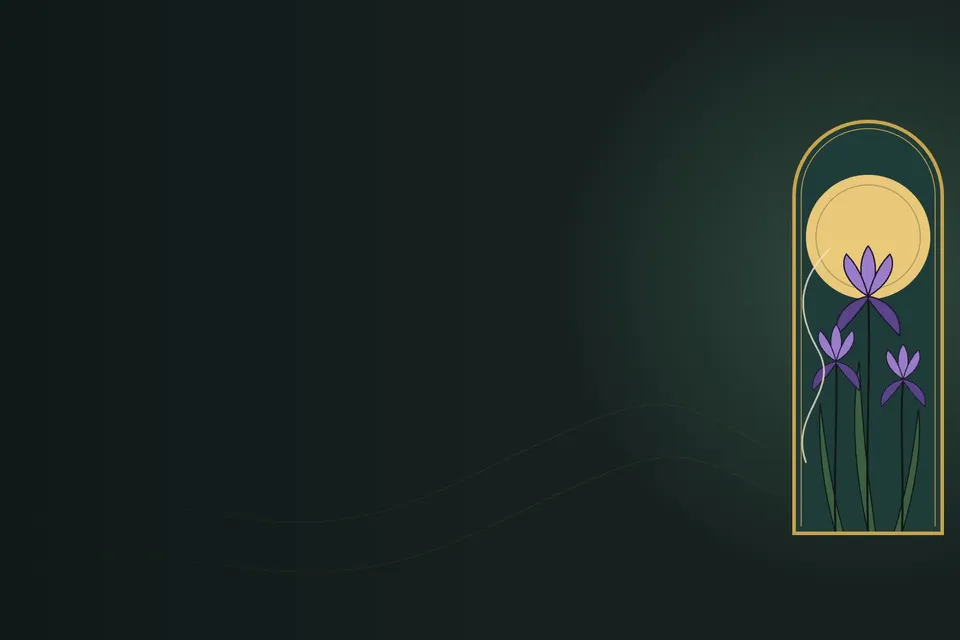
Art Nouveau is the moment, around 1890 to 1910, when European designers decided that a staircase rail, a metro entrance, a poster and a hair comb deserved the same care as a painting, and that the best teacher for all of them was a growing plant. It lasted barely twenty years, and it still looks alive.
This entry is a working guide for designers who want to use it today, in posters, brand work and interfaces. It covers what the style really is, how users experience it on a screen, how to start a design in its spirit, how to treat its history honestly and how to finish the work. Then it walks through five drawings, made for this post, on the themes of camping, earth, home and nature, plus a mobile app screen. Each one is explained step by step, down to the line of SVG that draws it.
The core essence: line that grows
If you keep only one idea, keep this: in Art Nouveau the line is the structure, and the line behaves like something alive. It does not outline a shape and stop. It grows out of a stem, swells, thins, turns back on itself and ends in a curl, the way a tendril or a wave does. Everything else in the style follows from treating line this way.
- The whiplash curve. The signature line is a long S-curve that accelerates and then snaps back, like a cracked whip. It got its name from Hermann Obrist’s 1895 embroidery Cyclamen, which a critic called the “whiplash”.
- Nature as grammar, not decoration. Designers studied real plants, insects and water, then reduced them to rules: how a stem tapers, how petals repeat, how a leaf turns. The result is stylised but never random.
- Ornament and function are one object. Hector Guimard’s Paris Métro entrances are lamps, railings and signs that are also stems and buds. The decoration is not stuck on; it is the structure.
- Flat colour held by a contour. Posters were printed by colour lithography, so colour came in flat areas held in place by strong outlines, a lesson also learnt from Japanese woodblock prints.
- Frames, halos and arches. A circle behind the subject (a halo, sun or moon) and an arched or panelled frame give the image a centre and an architecture. Motifs often break out of the frame, which makes it feel alive.
- Lettering drawn by hand. Type was drawn to belong to the image, often fitted into panels and bands, with curves that echo the ornament.
The most compelling part is the promise behind all this: an everyday object can be beautiful because it understands nature. That is why the style still moves people. It feels made by a person, for a person, at a time when most things feel produced.
How users perceive and experience it
Users never say “this is Art Nouveau”. They say a page feels warm, crafted, calm or special. Those reactions are predictable, and so are the risks, so design for both.
- Warmth and craft. Curved lines and hand-drawn details signal that a person made this. Users read it as care, which builds trust for products that sell experiences: hotels, restaurants, cafés, outdoor brands, wellness, books.
- Slowness. Flowing lines guide the eye in long curves instead of grids, so people slow down. That suits storytelling and brand pages. It hurts task-heavy screens such as dashboards, checkouts and forms.
- Heritage and luxury. The style carries the memory of Paris posters and jewellery, so it lends a premium, timeless air, without the cold feeling of minimal luxury.
- Nature and comfort. Organic forms are restful to look at, and users link them with the outdoors and with home. That makes the style a natural fit for camping, gardening and food brands.
- Delight in discovery. Small details, a curl at the end of a divider or a leaf on a button, reward the second look. Users remember them.
The risks are just as real. Too much ornament competes with content. Decorative lettering is slow or impossible to read at small sizes. Low-contrast palettes (gold on cream, sage on sand) can fail accessibility checks. And busy SVG ornament can cost load time and battery on phones.
Beginning the design: the conceptual thinking
Art Nouveau begins before you draw a curve. The designers of the 1890s started from one observed natural form and one idea about the object, and built everything from those two. Work the same way.
- Name the feeling and the user. Write one sentence: “A quiet, firelit evening for people who camp to slow down.” Every later choice is tested against it.
- Choose one natural motif as the design’s DNA. One plant, insect or element: pine, iris, fern, smoke, water. One motif gives unity; five give a souvenir shop.
- Study the real thing. Draw it from life or from photographs before you stylise it, as Eugène Grasset taught in his 1896 plant studies for ornament. Note how the stem tapers, how many petals there are and how they overlap.
- Turn the study into rules. Decide your line rule (how thick, how it tapers, how it ends), your repeat (symmetry or rhythm) and your simplification (how many curves per leaf).
- Build the architecture first. Choose the format, the frame (arch, panel, circle) and the focal point. In UI this is the layout grid and the content zones.
- Decide where ornament is allowed. Mark the zones on a wireframe: frames and headers yes, body text and form fields no.
- Pick the palette from the motif. Take four to six colours from the real subject (moss, bark, ember, moon), then add one dark for contour and text.
- Choose the lettering voice. A display face or hand lettering for headings that echoes your curves, and a plain text face for reading.
Approaching the historical context
Art Nouveau grew in the 1880s and 1890s as a reaction against two things: the copying of past styles (neo-Gothic, neo-Renaissance) and the cheap, machine-made ornament of the industrial age. It took ideas from the British Arts and Crafts movement around William Morris (honest materials, the dignity of craft) and from Japanese prints, which reached Europe in large numbers and showed flat colour, bold outline and asymmetric compositions.
- The name comes from Siegfried Bing’s Paris gallery, the Maison de l’Art Nouveau, which opened in December 1895.
- Belgium: Victor Horta’s Hôtel Tassel in Brussels (1893) is often called the first fully Art Nouveau building; its iron columns and painted walls turn into tendrils.
- France: Alphonse Mucha’s posters for the actress Sarah Bernhardt, from Gismonda (1894–95) onwards; Guimard’s Métro entrances (around 1900); Émile Gallé’s glass and the School of Nancy, full of irises and dragonflies; René Lalique’s jewellery.
- Germany: Jugendstil, named after the Munich magazine Jugend (“Youth”), founded in 1896.
- Austria: the Vienna Secession (1897), with Gustav Klimt; more geometric, with squares beside the curves.
- Scotland: Charles Rennie Mackintosh and the Glasgow School; tall, straight lines and rose motifs.
- Spain: Catalan Modernisme, above all Antoni Gaudí in Barcelona.
- Italy and the United States: Stile Liberty (named after the London shop Liberty & Co.) and Louis Comfort Tiffany’s glass.
The style peaked at the Paris Exposition of 1900 and faded before the First World War. Its heir, Art Deco, kept the love of luxury and craft but swapped the plant for the machine: straight lines, symmetry and speed.
Drawing technique: the line, step by step
All five examples below use the same technique, so learn it once here. It works with a pencil, in Illustrator or Figma with the pen tool, or directly in SVG code, which is what this post uses so you can read every line.
The whiplash curve
A whiplash is two cubic Bézier curves joined smoothly. The dots on the dashed lines are the control handles: they pull the line towards them without touching it. Where two curves meet, the handles sit on one straight line, which is what makes the join smooth instead of kinked.
<svg xmlns="http://www.w3.org/2000/svg" viewBox="0 0 400 300"> <rect width="400" height="300" fill="#f3ead6"/> <g stroke="#b5653a" stroke-width="1.5" stroke-dasharray="4 4"> <path d="M40 260 L40 160"/><path d="M200 80 L200 200"/><path d="M320 50 L260 60"/> </g> <g fill="#b5653a"><circle cx="40" cy="160" r="4"/><circle cx="200" cy="200" r="4"/><circle cx="200" cy="80" r="4"/><circle cx="260" cy="60" r="4"/></g> <path d="M40 260 C40 160 200 200 200 140 S260 60 320 50" fill="none" stroke="#1f3b3a" stroke-width="10" stroke-linecap="round"/> <path d="M40 260 C40 160 200 200 200 140 S260 60 320 50" fill="none" stroke="#c9a24a" stroke-width="3" stroke-linecap="round"/> <path d="M320 50 C352 44 364 18 342 10 C322 4 310 26 324 32 C334 36 338 26 331 22" fill="none" stroke="#1f3b3a" stroke-width="4" stroke-linecap="round"/> <g fill="#1f3b3a"><circle cx="40" cy="260" r="5"/><circle cx="200" cy="140" r="5"/></g></svg>Line by line
- The canvas. viewBox sets a 400 × 300 drawing space; every number below is a position in it.
- Paper first. Art Nouveau colour sits on a warm ground, never pure white.
- The construction lines, dashed, so you can see the handles. In a finished piece you delete these.
- The four handle points. Note that the two in the middle, (200, 80) and (200, 200), sit on one vertical line through the join at (200, 140). That alignment is what makes the curve smooth.
- The line itself. M40 260 starts at the bottom left. C40 160 200 200 200 140 is the first curve: it leaves straight up, gets pulled right, and arrives at (200, 140) moving upwards. S260 60 320 50 continues smoothly: S mirrors the last handle automatically, then bends right to finish at (320, 50).
- The same path again, thinner and gold. A thick dark stroke under a thin light one is the classic poster contour: a strong outline with colour inside.
- The curl. Three short curves wind inwards, each smaller than the last, so the line ends by turning back on itself. A whiplash should never just stop.
- The two anchor points marked in dark: the start and the smooth join.
The process for any piece
- Format. Choose a tall format (5:7 or 2:3) for posters and panels. Art Nouveau loves the vertical.
- Frame. Draw the frame first: an arch, a panel or a band. It is the architecture everything else lives in.
- Halo. Place a circle behind the focal point, usually above the centre. It becomes sun, moon, earth or simply a glow.
- Big shapes. Block in the main masses (trees, door, flower heads) as flat silhouettes. Check the composition in black and white before any detail.
- The flowing line. Add one dominant whiplash (smoke, root, stem, vine) that leads the eye through the picture, ideally crossing from one zone to another.
- Contour. Outline every shape in one dark colour. Use two weights: a heavy outer contour and a lighter inner line for detail.
- Flat colour. Fill with four to six flat colours. No gradients inside shapes; depth comes from overlap and from light against dark.
- Ornament. Add the small things last: a double frame line, curls at the ends of bands, a repeated dot or leaf.
- Lettering. Fit the words into a band or panel, in capitals with generous spacing, aligned to the frame.
- Break the frame once. Let one element cross the border (a dragonfly’s wing, a tendril) so the image feels alive rather than boxed.
Five examples, line by line
Each example is a complete SVG file. Read the picture first, then the code: the notes beside the lines explain each step in the order it is drawn. Later lines are drawn on top of earlier ones, so the order of the code is the order of the painting.
1. Camping vibe: Campfire Under the Pines
The concept: a poster for a campsite or an outdoor brand, built on the feeling “a quiet, firelit evening”. The motif DNA is smoke. It rises from the fire as a whiplash and ties the ground to the sky, the way the smell of a campfire ties an evening together.
<svg xmlns="http://www.w3.org/2000/svg" viewBox="0 0 600 840"> <rect width="600" height="840" fill="#f1e4c8"/> <path d="M40 810 V280 A260 260 0 0 1 560 280 V810 Z" fill="#1f3b3a"/> <circle cx="300" cy="300" r="175" fill="#e9c879"/> <circle cx="300" cy="300" r="150" fill="none" stroke="#1f3b3a" stroke-width="2" opacity=".3"/> <circle cx="300" cy="300" r="125" fill="none" stroke="#1f3b3a" stroke-width="1.5" opacity=".2"/> <g fill="#f1e4c8"> <circle cx="96" cy="250" r="2.5"/><circle cx="150" cy="170" r="2"/> <circle cx="470" cy="150" r="2.5"/><circle cx="520" cy="260" r="2"/> </g> <g fill="#2f5a4a" stroke="#13201f" stroke-width="3" stroke-linejoin="round"> <path d="M130 220 L175 330 L150 322 L195 440 L160 430 L210 560 L165 552 L220 660 L40 660 L95 552 L50 560 L100 430 L65 440 L110 322 L85 330 Z"/> <path d="M470 200 L515 310 L490 302 L535 420 L500 410 L550 540 L505 532 L555 660 L385 660 L435 532 L390 540 L440 410 L405 420 L450 302 L425 310 Z"/> </g> <path d="M40 640 C160 600 240 625 300 640 S470 600 560 630 V810 H40 Z" fill="#3d5f3f" stroke="#13201f" stroke-width="3"/> <path d="M140 722 L212 606 L284 722 Z" fill="#c96f3a" stroke="#13201f" stroke-width="3" stroke-linejoin="round"/> <path d="M212 640 L190 722 H234 Z" fill="#5e2716"/> <path d="M385 630 C340 580 430 540 380 480 S330 380 400 330 S470 240 420 170" fill="none" stroke="#13201f" stroke-width="12" stroke-linecap="round"/> <path d="M385 630 C340 580 430 540 380 480 S330 380 400 330 S470 240 420 170" fill="none" stroke="#f8f1e0" stroke-width="6" stroke-linecap="round"/> <path d="M362 724 L412 700 M362 700 L412 724" stroke="#5e2716" stroke-width="8" stroke-linecap="round"/> <path d="M387 712 C352 690 368 662 384 636 C390 660 412 672 402 694 C416 684 412 670 418 662 C432 690 418 712 387 712 Z" fill="#e3742f" stroke="#13201f" stroke-width="3"/> <path d="M388 706 C376 694 382 680 388 668 C394 682 400 694 388 706 Z" fill="#f6c45a"/> <path d="M40 810 V280 A260 260 0 0 1 560 280 V810 Z" fill="none" stroke="#c9a24a" stroke-width="8"/> <path d="M56 794 V280 A244 244 0 0 1 544 280 V794" fill="none" stroke="#c9a24a" stroke-width="2"/> <rect x="40" y="744" width="520" height="66" fill="#c9a24a"/> <circle cx="62" cy="777" r="9" fill="none" stroke="#1f3b3a" stroke-width="3"/> <circle cx="538" cy="777" r="9" fill="none" stroke="#1f3b3a" stroke-width="3"/> <text x="300" y="786" text-anchor="middle" font-family="'Cormorant Garamond', serif" font-size="22" font-weight="600" letter-spacing="3" fill="#1f3b3a">CAMPFIRE UNDER THE PINES</text></svg>Line by line
- Paper ground in warm cream. It shows only outside the arch, like the margin of a printed poster.
- The arch, filled with deep teal for the night. V280 rises up the left side, the A command draws a half circle of radius 260 across the top, and V810 comes down the right.
- The halo: a large moon behind the centre of the scene. It is the focal point the trees frame.
- Two faint rings inside the moon. These echo rings are a typical Art Nouveau way to give a flat disc depth and rhythm without shading.
- Four small stars, placed asymmetrically, as in Japanese prints.
- Shared style for both pines: moss green fill, dark contour, rounded joins so the points are firm but not sharp.
- The left pine as one silhouette: from the tip (130, 220) the outline steps down the right side in three tiers (each tier juts out, then tucks in), runs along the base, and climbs back up the left side in mirror image.
- The right pine, the same shape moved and made slightly taller. Two near-twins either side of the moon make a symmetrical frame without looking mechanical.
- The hill: a gentle wave drawn with C and S curves, closed down to the bottom of the arch. It hides the base of the trees and gives the scene its ground.
- The tent: a simple triangle in ember orange, the warmest colour after the fire, placed on the left to balance the fire on the right.
- The tent door, a narrow dark triangle. One dark shape inside a light one reads instantly as an opening.
- The smoke, first pass: a thick dark stroke. It starts above the fire and climbs in three S-curves past the moon. This is the outline layer.
- The smoke, second pass: the same path, thinner and cream, on top. The dark edge lets light smoke stay visible against a light moon.
- Two crossed logs, drawn as two straight strokes with round caps.
- The flame: one closed path of curves that rises into three tongues of different heights. Flames are whiplash curves too, just short ones.
- The bright core of the flame, a small teardrop in yellow, which makes the fire glow without any gradient.
- The gold frame, drawn last so it sits on top of everything: the same arch path as the sky, stroked instead of filled.
- A thin inner frame line 16 units inside the first. A heavy and a light line together is the classic double frame.
- The lettering band, a solid gold panel at the foot of the arch, as on a Mucha poster.
- Two small rings to close the ends of the band, like the rivets of a metal sign.
- The title in capitals, centred (text-anchor="middle"), with wide letter-spacing so it reads as part of the ornament.
Why it works: one warm light source (the fire), one cool one (the moon), one flowing line connecting them, and a frame that holds everything still. Remove the smoke and the poster is only a nice illustration; with it, the eye travels.
2. Earth: Terra
The concept: a label or poster for an earth-friendly brand, a ceramics studio or an organic farm, on the idea “everything grows from the soil”. The motif DNA is roots. The earth is shown as a cut-away disc: mountains above, soil strata below, a seedling on top and roots spreading out underneath.
<svg xmlns="http://www.w3.org/2000/svg" viewBox="0 0 600 840"> <defs> <clipPath id="disc"><circle cx="300" cy="360" r="190"/></clipPath> </defs> <rect width="600" height="840" fill="#efe3c9"/> <rect x="30" y="30" width="540" height="780" fill="none" stroke="#5a3420" stroke-width="6"/> <rect x="44" y="44" width="512" height="752" fill="none" stroke="#5a3420" stroke-width="1.5"/> <circle cx="300" cy="360" r="208" fill="none" stroke="#b5653a" stroke-width="2"/> <g clip-path="url(#disc)"> <rect x="100" y="160" width="400" height="400" fill="#e9c48a"/> <circle cx="380" cy="260" r="34" fill="#f5dfae"/> <path d="M100 380 L190 270 L235 320 L300 225 L370 330 L410 290 L500 380 V420 H100 Z" fill="#6f7d4f" stroke="#3a2416" stroke-width="3" stroke-linejoin="round"/> <path d="M100 380 C180 362 240 398 300 380 S420 362 500 380 V445 H100 Z" fill="#b5653a"/> <path d="M100 440 C180 422 240 458 300 440 S420 422 500 440 V505 H100 Z" fill="#8a4a2b"/> <path d="M100 500 C180 482 240 518 300 500 S420 482 500 500 V560 H100 Z" fill="#5a3420"/> </g> <circle cx="300" cy="360" r="190" fill="none" stroke="#3a2416" stroke-width="6"/> <path d="M300 170 C300 140 300 118 300 92" stroke="#3a2416" stroke-width="5" stroke-linecap="round"/> <path d="M300 128 C272 96 240 100 226 124 C252 132 278 134 300 128 Z" fill="#6f7d4f" stroke="#3a2416" stroke-width="2.5"/> <path d="M300 112 C328 80 360 84 374 108 C348 116 322 118 300 112 Z" fill="#6f7d4f" stroke="#3a2416" stroke-width="2.5"/> <g fill="none" stroke="#3a2416" stroke-linecap="round"> <path d="M300 550 C300 610 240 620 200 650 S118 716 150 758 S206 768 190 738" stroke-width="5"/> <path d="M300 550 C300 610 360 620 400 650 S482 716 450 758 S394 768 410 738" stroke-width="5"/> <path d="M300 550 C292 620 318 676 300 748" stroke-width="4"/> <path d="M232 628 C214 652 176 650 160 676" stroke-width="1.5"/> <path d="M368 628 C386 652 424 650 440 676" stroke-width="1.5"/> </g> <text x="300" y="792" text-anchor="middle" font-family="'Cormorant Garamond', serif" font-size="34" font-weight="600" letter-spacing="18" fill="#5a3420">TERRA</text></svg>Line by line
- A clipPath, defined once: the circle that everything inside the earth is cut to. Anything drawn with clip-path="url(#disc)" shows only inside this circle.
- The paper ground.
- The double frame: a heavy outer rectangle and a thin one 14 units inside it.
- An outer halo ring in terracotta, just outside the disc, so the earth seems to glow.
- Start of the clipped group: from here to its closing tag, every shape is trimmed to the circle.
- The sky, a square larger than the disc. The clip makes it round.
- A pale sun, set off-centre to the right so the composition is not rigidly symmetrical.
- The mountains: straight lines up and down to three peaks of different heights, then closed below the soil line so no gap shows.
- Three soil strata, each the same wave shape moved down 60 units and painted darker: terracotta, sienna, dark earth. Repetition with variation is the core of Art Nouveau rhythm.
- The contour of the disc, drawn after the clipped group so it covers the cut edges.
- The seedling stem, rising from the top of the earth.
- Two leaves, each a closed shape of two curves meeting at a point. The right leaf sits higher than the left, as real leaves alternate.
- Shared style for the roots: dark, unfilled, with round ends.
- The left root: it drops from the base of the disc, bends out in a whiplash, and ends with S-curves that curl back up. That final curl is the signature move.
- The right root, an exact mirror: every x value becomes 600 − x. Mirror symmetry in the roots balances the off-centre sun above.
- The taproot, straight down and slightly thinner.
- Two hairline side roots at 1.5 units. The contrast between 5-unit and 1.5-unit lines is the line-weight hierarchy.
- The name, with very wide letter-spacing (18) so five letters span the base like an inscription.
Why it works: the circle reads as earth, sun and seed at once, and the roots below mirror the mountains above. The palette is literally taken from soil: ochre, terracotta, sienna, umber and moss.
3. Home: The Hearth Door
The concept: an identity for a guesthouse, a homeware shop or a family brand, on the idea “the warm light behind a front door”. The motif DNA is the climbing vine, borrowed from Guimard’s Métro entrances, where iron stems rise and bend into an arch.
<svg xmlns="http://www.w3.org/2000/svg" viewBox="0 0 600 840"> <rect width="600" height="840" fill="#ead9b6"/> <ellipse cx="300" cy="800" rx="230" ry="40" fill="#f2c46d" opacity=".45"/> <rect x="24" y="24" width="552" height="792" fill="none" stroke="#3f5a3a" stroke-width="4"/> <text x="300" y="92" text-anchor="middle" font-family="'Cormorant Garamond', serif" font-size="40" font-weight="600" letter-spacing="20" fill="#3f5a3a">HOME</text> <path d="M200 800 V400 A100 100 0 0 1 400 400 V800 Z" fill="#7a4b2a" stroke="#2c1d12" stroke-width="4"/> <path d="M216 400 A84 84 0 0 1 384 400 Z" fill="#f2c46d" stroke="#2c1d12" stroke-width="3"/> <g stroke="#2c1d12" stroke-width="2.5"> <path d="M300 400 V316"/><path d="M300 400 L241 341"/><path d="M300 400 L359 341"/> </g> <g fill="#c4553a" stroke="#2c1d12" stroke-width="2"> <path d="M300 372 C288 360 288 344 294 336 L300 346 L306 336 C312 344 312 360 300 372 Z"/> <path d="M262 382 C252 372 254 358 260 352 L264 362 L270 354 C274 364 272 376 262 382 Z"/> <path d="M338 382 C348 372 346 358 340 352 L336 362 L330 354 C326 364 328 376 338 382 Z"/> </g> <g fill="none" stroke="#2c1d12" stroke-width="3"> <path d="M222 790 V440 Q222 420 242 420 H286 V790"/> <path d="M314 790 V420 H358 Q378 420 378 440 V790"/> </g> <circle cx="300" cy="610" r="7" fill="#c9a24a" stroke="#2c1d12" stroke-width="2"/> <g fill="none" stroke="#3f5a3a" stroke-linecap="round"> <path d="M150 810 C150 600 140 400 170 300 C200 200 260 170 300 170" stroke-width="14"/> <path d="M450 810 C450 600 460 400 430 300 C400 200 340 170 300 170" stroke-width="14"/> <path d="M166 320 C118 296 100 248 122 218 C138 198 164 210 152 232" stroke-width="5"/> <path d="M434 320 C482 296 500 248 478 218 C462 198 436 210 448 232" stroke-width="5"/> </g> <g fill="#6f8f4f" stroke="#2c1d12" stroke-width="1.5"> <ellipse cx="140" cy="520" rx="22" ry="8" transform="rotate(-35 140 520)"/> <ellipse cx="164" cy="430" rx="22" ry="8" transform="rotate(30 164 430)"/> <ellipse cx="460" cy="520" rx="22" ry="8" transform="rotate(35 460 520)"/> <ellipse cx="436" cy="430" rx="22" ry="8" transform="rotate(-30 436 430)"/> </g> <circle cx="300" cy="160" r="15" fill="#c9a24a" stroke="#2c1d12" stroke-width="3"/></svg>Line by line
- Warm plaster-coloured wall.
- The pool of light on the ground, a flat yellow ellipse at partial opacity. It is drawn early so the door and vine sit on top of it.
- A single thin frame line in vine green.
- The word, set above the arch, so the door can stand alone.
- The door: up the left side, a half circle of radius 100 across the top, and down the right. Rounded doors feel welcoming; square ones feel like offices.
- The fanlight, a half disc of glowing yellow inside the door’s arch. Warm light from inside is the whole story of a home.
- The lead lines of the stained glass: three lines fanning out from the centre of the base, like the leading between glass panes.
- Shared style for the tulips: a warm red with thin dark outlines, as if cut from glass.
- Three tulips, one in each pane. Each is a cup shape with two small points at the top. The centre one is largest, and the side ones lean outwards, mirrored.
- The two door panels: long rectangles with one rounded top corner each, so together they echo the arch.
- The door knob, in gold, the one accent of metal.
- Shared style for the vine: green, unfilled, round-ended.
- The left vine stem, 14 units thick: almost straight at the bottom, then bending inwards to meet at the top. Thick at the root and curving at the top is how a real stem behaves.
- The right stem, mirrored. The two meet at (300, 170) and form the arch: the frame is the plant.
- Two tendrils that leave the shoulders of the arch, sweep outwards and curl back. They are thinner (5 units) so they read as growth, not structure.
- Four leaves, each an ellipse rotated to follow the stem. The rotate(angle cx cy) form spins each leaf around its own centre.
- The gold bud where the stems meet, the keystone of the arch and a direct quote of Guimard’s lamp buds.
Why it works: the eye goes to the glowing fanlight, the warmest and lightest shape, which is exactly the emotional point. The vine makes a doorway into a living thing, which is the Art Nouveau idea in its purest form.
4. Nature: Iris and Dragonfly
The concept: a decorative panel or a packaging design for a tea, perfume or garden brand, in the spirit of Gallé’s glass and Japanese prints. The motif DNA is the iris, the favourite flower of the period, with a dragonfly, its favourite insect.
<svg xmlns="http://www.w3.org/2000/svg" viewBox="0 0 600 840"> <defs> <g id="iris" stroke="#2a2340" stroke-width="2" stroke-linejoin="round"> <path d="M0 0 C-18 -30 -10 -62 0 -74 C10 -62 18 -30 0 0 Z" fill="#8a6bb8"/> <path d="M0 0 C-32 -18 -42 -46 -32 -62 C-16 -46 -6 -24 0 0 Z" fill="#8a6bb8"/> <path d="M0 0 C32 -18 42 -46 32 -62 C16 -46 6 -24 0 0 Z" fill="#8a6bb8"/> <path d="M0 0 C-26 4 -52 26 -46 58 C-30 42 -14 24 0 4 Z" fill="#4a3577"/> <path d="M0 0 C26 4 52 26 46 58 C30 42 14 24 0 4 Z" fill="#4a3577"/> <path d="M-4 2 C-6 14 -4 24 0 30 C4 24 6 14 4 2 Z" fill="#e2b33c" stroke="none"/> </g> </defs> <rect width="600" height="840" fill="#f3ead6"/> <circle cx="300" cy="270" r="160" fill="#e3d3a6"/> <g fill="none" stroke="#6b8a8a" stroke-width="2.5" stroke-linecap="round"> <path d="M40 720 C120 708 180 732 260 720 S420 708 560 720"/> <path d="M40 752 C140 740 200 764 300 752 S460 740 560 752"/> <path d="M40 784 C110 772 190 796 280 784 S440 772 560 784"/> </g> <g fill="#6b8a4a" stroke="#2c3a22" stroke-width="2" stroke-linejoin="round"> <path d="M300 800 C258 660 248 520 270 410 C274 540 290 660 316 800 Z"/> <path d="M220 800 C186 700 168 600 176 500 C188 610 206 700 236 800 Z"/> <path d="M384 800 C420 690 440 580 430 470 C418 590 400 690 368 800 Z"/> </g> <g fill="none" stroke="#2c3a22" stroke-width="4" stroke-linecap="round"> <path d="M300 800 C294 620 306 420 300 300"/> <path d="M220 800 C214 640 226 480 222 380"/> <path d="M384 800 C390 650 380 520 388 410"/> </g> <use href="#iris" transform="translate(300 300)"/> <use href="#iris" transform="translate(222 380) scale(.8)"/> <use href="#iris" transform="translate(388 410) scale(.75)"/> <g stroke="#2a2340" stroke-width="1.5" fill="#cfe3e0" fill-opacity=".85"> <ellipse cx="422" cy="118" rx="62" ry="12" transform="rotate(-18 422 118)"/> <ellipse cx="518" cy="104" rx="62" ry="12" transform="rotate(14 518 104)"/> <ellipse cx="426" cy="140" rx="52" ry="10" transform="rotate(12 426 140)"/> <ellipse cx="514" cy="134" rx="52" ry="10" transform="rotate(-16 514 134)"/> </g> <path d="M470 112 L470 230" stroke="#2f5a4a" stroke-width="7" stroke-linecap="round"/> <circle cx="470" cy="104" r="9" fill="#2f5a4a"/> <rect x="24" y="24" width="552" height="792" fill="none" stroke="#4d5e3a" stroke-width="5"/> <text x="300" y="72" text-anchor="middle" font-family="'Cormorant Garamond', serif" font-size="22" font-weight="600" letter-spacing="6" fill="#4d5e3a">IRIS & DRAGONFLY</text></svg>Line by line
- The iris is defined once, inside defs, as a group with an id. Drawn around the point (0, 0), it can be placed anywhere later. This is how a pattern designer works: one stamp, many prints.
- The centre standard: the upright petal, a pointed shape of two curves meeting at the top.
- The left and right standards, leaning outwards and mirrored (every x is negated).
- The falls: the two drooping petals, in a deeper violet. Darker below and lighter above gives the flower volume with no shading.
- The beard, a small yellow stroke at the heart of the fall. One tiny warm accent makes the violet sing.
- The paper ground.
- The halo behind the tallest flower, in pale gold.
- Three water lines: the same gentle wave drawn three times, shifted down 32 units each time. Horizontal calm at the bottom, vertical growth above.
- Three blade leaves, each a long narrow shape that rises and comes back down. They lean in different directions, so the clump feels natural.
- Three stems, almost straight with a slight sway. The tallest is in the middle, as in a classic flower arrangement.
- The first iris, placed with use and moved (translate) to the top of the centre stem.
- Two more copies, smaller (scale .8 and .75) and lower, on the side stems. Different sizes make depth.
- The dragonfly’s four wings: thin ellipses, rotated so each pair spreads out like a V, in a pale glassy colour at 85% opacity.
- The body, one thick straight stroke.
- The head.
- The frame is drawn last. Its corner is crossed by the dragonfly’s wing tips, which almost leave the panel: the element that breaks the frame.
- The title. In SVG an ampersand must be written as the entity
&.
Why it works: the strong verticals of stems and leaves against the horizontal water make a calm grid, and the curves of petals and wings play over it. Using one defined flower three times keeps everything consistent, the same way a design system keeps an interface consistent.
5. UI: Trailhead, a camping booking app
The concept: the home screen of an app that books quiet camping pitches. It applies the rules for interfaces above: the ornament lives in the arched header, one small whiplash divider and two curls on the button. The list, prices and actions stay plain and highly readable.
<svg xmlns="http://www.w3.org/2000/svg" viewBox="0 0 600 840"> <defs> <clipPath id="hero"><path d="M144 300 V200 A156 130 0 0 1 456 200 V300 Z"/></clipPath> </defs> <rect width="600" height="840" fill="#1a2726"/> <rect x="120" y="30" width="360" height="780" rx="46" fill="#f4ead6" stroke="#0d1514" stroke-width="10"/> <g clip-path="url(#hero)"> <rect x="144" y="60" width="312" height="240" fill="#1f3b3a"/> <circle cx="300" cy="190" r="56" fill="#e9c879"/> <path d="M190 300 L225 170 L260 300 Z M340 300 L378 150 L416 300 Z" fill="#2f5a4a"/> <path d="M144 270 C220 250 260 266 300 262 S400 248 456 266 V300 H144 Z" fill="#3d5f3f"/> </g> <path d="M144 300 V200 A156 130 0 0 1 456 200 V300 Z" fill="none" stroke="#c9a24a" stroke-width="3"/> <text x="300" y="346" text-anchor="middle" font-family="'Cormorant Garamond', serif" font-size="34" font-weight="600" fill="#1f3b3a">Trailhead</text> <text x="300" y="368" text-anchor="middle" font-family="'Source Sans 3', sans-serif" font-size="13" fill="#4a5a55">Book a quiet pitch under the pines</text> <path d="M206 388 C240 376 262 400 300 388 S360 376 394 388" fill="none" stroke="#c9a24a" stroke-width="1.5"/> <circle cx="300" cy="388" r="3.5" fill="#c9a24a"/> <g font-family="'Source Sans 3', sans-serif"> <rect x="144" y="408" width="312" height="104" rx="18" fill="#fffaf0" stroke="#d8c49a"/> <path d="M160 496 V448 A30 30 0 0 1 220 448 V496 Z" fill="#3d5f3f"/> <text x="236" y="442" font-size="16" font-weight="700" fill="#1f3b3a">Pine Hollow · Site 4</text> <text x="236" y="464" font-size="12" fill="#5b6b66">Fire ring · Lakeside · 2 tents</text> <text x="236" y="492" font-size="14" font-weight="700" fill="#b5653a">$24 / night</text> <rect x="144" y="528" width="312" height="104" rx="18" fill="#fffaf0" stroke="#d8c49a"/> <path d="M160 616 V568 A30 30 0 0 1 220 568 V616 Z" fill="#6f7d4f"/> <text x="236" y="562" font-size="16" font-weight="700" fill="#1f3b3a">Fern Terrace · Site 9</text> <text x="236" y="584" font-size="12" fill="#5b6b66">Shade · Stream · 1 tent</text> <text x="236" y="612" font-size="14" font-weight="700" fill="#b5653a">$18 / night</text> <rect x="164" y="660" width="272" height="52" rx="26" fill="#1f3b3a"/> <text x="300" y="692" text-anchor="middle" font-size="16" font-weight="700" fill="#f4ead6">Book a pitch</text> </g> <path d="M186 686 C176 676 186 664 196 672" fill="none" stroke="#c9a24a" stroke-width="2"/> <path d="M414 686 C424 676 414 664 404 672" fill="none" stroke="#c9a24a" stroke-width="2"/> <path d="M144 740 H456" stroke="#d8c49a"/> <g fill="#1f3b3a"><circle cx="210" cy="770" r="6"/><circle cx="300" cy="770" r="6" fill="#c9a24a"/><circle cx="390" cy="770" r="6"/></g></svg>Line by line
- A clipPath in the shape of an arch, used to cut the header scene. The same arch shape appears again as the thumbnails: one motif, repeated at two sizes.
- The dark presentation background behind the phone.
- The phone: a rounded rectangle (rx="46") with a warm paper-coloured screen, not white.
- Start of the header scene, trimmed to the arch.
- A small version of example 1: night sky, moon halo, two pines as plain triangles and a hill. At phone size, detail must be reduced to the biggest shapes.
- The arch outline in gold, the only full ornamental frame on the screen.
- The app name in Cormorant Garamond, the display face. Only the title uses it.
- The tagline in Source Sans 3, a plain sans-serif chosen for legibility, in a dark grey that passes contrast on cream.
- The divider: a tiny whiplash, two curves joined at the centre. This is the one flowing line on the screen.
- A gold dot at the centre of the divider, the ornament’s full stop.
- From here everything uses the text face: content is for reading, not admiring.
- Card one: a white-cream rounded rectangle with a soft gold border. The 18-unit radius matches the friendliness of the arches.
- The thumbnail, shaped as a small arch. In a real app this is a photo clipped to the arch shape.
- Three lines of text with a clear hierarchy: bold name, small grey details, bold price in ember. Users scan these three things in this order.
- Card two repeats card one exactly, moved down 120 units. Consistency is what makes a list scannable.
- The main button: a full pill (rx = half its height) in deep teal, the strongest contrast on the screen, so it is obviously the action.
- The button label in bold, light on dark.
- Two small gold curls inside the ends of the button, mirrored. Decoration on the action, but outside the label, so it never affects legibility.
- A hairline separating the tab bar.
- The tab bar: three plain dots, with the active one in gold. Navigation stays conventional.
Why it works: users feel the style in the first second (arch, moon, gold), then get out of its way to do the task. The same palette and the arch shape tie the screen to the poster in example 1, so a printed campsite sign and the app clearly belong to one brand.
The final polish
Art Nouveau is unforgiving of rough edges: the whole style is a promise of care. Finish each piece with this checklist.
- Line-weight audit. Use no more than three weights: heavy contour, medium detail, hairline. Check that every line belongs to one of them.
- Curve check. Zoom in on every join. Handles either side of a point must line up, or the curve shows a kink. Remove extra anchor points; fewer points make smoother curves.
- Optical balance. Mirrored shapes often look lopsided next to off-centre elements. Nudge by eye, not by numbers, and squint at the whole image.
- Palette discipline. Limit yourself to four to six colours plus the contour dark. Test the image in greyscale: the focal point should still be the lightest or darkest area.
- Lettering. Kern capitals by hand, align text to the frame, and check the smallest size at which it will appear.
- Accessibility. Check every text colour with a contrast tool (WCAG 2.2: 4.5:1 for body, 3:1 for large text). Give decorative SVG aria-hidden="true", and give meaningful images a real text alternative.
- SVG clean-up. Remove hidden layers and construction lines, round coordinates to whole numbers or one decimal, reuse shapes with use, and run the file through an optimiser such as SVGO.
- Motion, if any. Draw a line in once using stroke-dasharray and stroke-dashoffset, over a second or so, and skip it entirely when the user prefers reduced motion.
- Test at real sizes. Print the poster at full size, view the app on a real phone in sunlight, and look at the icon at 32 pixels. Ornament that works at one size can turn to noise at another.
- Rest, then cut. Come back the next day and remove one ornament. Art Nouveau is rich, but the best pieces always know where to stop.
Start with one plant, one line and one frame. Draw the curve until it feels like it grew rather than was placed. When it does, you have understood what the designers of 1900 understood: that beauty in everyday things is not extra, it is part of how they work.
Sources
- Art Nouveau (Wikipedia: overview, dates, national movements)
- Maison de l’Art Nouveau (Wikipedia: Siegfried Bing’s gallery and the name)
- Hermann Obrist (Wikipedia: the Cyclamen “whiplash” embroidery)
- The Mucha Foundation (Alphonse Mucha’s posters and decorative panels)
- SVG paths tutorial (MDN: M, C, S and A commands)
- Understanding SC 1.4.3: Contrast (Minimum) (W3C, WCAG 2.2)
Art Nouveau ဆိုတာ ၁၈၉၀ ကနေ ၁၉၁၀ ဝန်းကျင်မှာ ဥရောပ designer တွေက လှေကားလက်ရန်း၊ metro ဝင်ပေါက်၊ ပိုစတာနဲ့ ဆံထိုးတစ်ချောင်းကိုတောင် ပန်းချီကားလို ဂရုစိုက်သင့်တယ်၊ ပြီးတော့ အဲဒါတွေ အားလုံးအတွက် အကောင်းဆုံး ဆရာက ကြီးထွားနေတဲ့ အပင်ပဲလို့ ဆုံးဖြတ်ခဲ့တဲ့ ကာလပါ။ နှစ်ဆယ်နှစ်လောက်ပဲ ခံခဲ့ပေမဲ့ ဒီနေ့ထိ အသက်ဝင်နေဆဲပါ။
ဒီ entry က ပိုစတာ၊ brand နဲ့ interface တွေမှာ ဒီ style ကို ဒီနေ့ သုံးချင်တဲ့ designer တွေအတွက် လက်တွေ့ လမ်းညွှန်ပါ။ Style ရဲ့ တကယ့် အနှစ်သာရ၊ screen ပေါ်မှာ အသုံးပြုသူတွေ ဘယ်လို ခံစားရလဲ၊ သူ့စိတ်ဓာတ်နဲ့ design တစ်ခုကို ဘယ်လို စမလဲ၊ သမိုင်းကို ရိုးရိုးသားသား ဘယ်လို ကိုင်တွယ်မလဲ၊ အလုပ်ကို ဘယ်လို အချောသတ်မလဲ ဆိုတာတွေ ပါပါတယ်။ ပြီးရင် ဒီ post အတွက် ဆွဲထားတဲ့ ပုံ ငါးပုံ — camping၊ မြေကမ္ဘာ၊ အိမ်၊ သဘာဝ နဲ့ mobile app screen တစ်ခု — ကို အဆင့်ဆင့်၊ ဆွဲတဲ့ SVG စာကြောင်း တစ်ကြောင်းချင်းအထိ ရှင်းပြထားပါတယ်။
အနှစ်သာရ: ကြီးထွားလာတဲ့ မျဉ်းကြောင်း
အယူအဆ တစ်ခုတည်းပဲ မှတ်ထားမယ်ဆိုရင် ဒါကို မှတ်ပါ: Art Nouveau မှာ မျဉ်းကြောင်းက ဖွဲ့စည်းပုံ ကိုယ်တိုင်ဖြစ်ပြီး အသက်ရှိတဲ့ အရာတစ်ခုလို ပြုမူပါတယ်။ ပုံသဏ္ဌာန်တစ်ခုကို ဘောင်ခတ်ပြီး ရပ်သွားတာ မဟုတ်ပါဘူး။ ပင်စည်ကနေ ပေါက်ထွက်၊ ဖောင်းလာ၊ ပါးလာ၊ ပြန်ကွေ့ပြီး ကွေးလိပ်လေးနဲ့ အဆုံးသတ်ပါတယ် — နွယ်တံ ဒါမှမဟုတ် လှိုင်းတစ်ခုလိုပါပဲ။ Style ရဲ့ ကျန်တာအားလုံးက မျဉ်းကို ဒီလို ဆက်ဆံရာကနေ ထွက်လာတာပါ။
- Whiplash curve (ကြာပွတ်ချက် မျဉ်းကွေး)။ လက္ခဏာရပ် မျဉ်းက အရှိန်တက်လာပြီး ကြာပွတ်ရိုက်သလို ပြန်ခါသွားတဲ့ S ပုံ မျဉ်းကွေး ရှည်ကြီးပါ။ ဒီနာမည်က Hermann Obrist ရဲ့ ၁၈၉၅ ခုနှစ် Cyclamen ပန်းထိုးကနေ လာတာပါ၊ ဝေဖန်ရေးဆရာ တစ်ယောက်က “whiplash” လို့ ခေါ်ခဲ့လို့ပါ။
- သဘာဝကို အလှဆင်ဖို့ မဟုတ်ဘဲ သဒ္ဒါအဖြစ် သုံးတာ။ Designer တွေက တကယ့် အပင်၊ အင်းဆက်နဲ့ ရေကို လေ့လာပြီး စည်းမျဉ်းတွေအဖြစ် ချုံ့ခဲ့ပါတယ် — ပင်စည် ဘယ်လို သွယ်လဲ၊ ပွင့်ချပ်တွေ ဘယ်လို ထပ်လဲ၊ အရွက် ဘယ်လို လှည့်လဲ။ ရလဒ်က stylise လုပ်ထားပေမဲ့ ဘယ်တော့မှ ကျပန်း မဟုတ်ပါဘူး။
- အလှဆင်မှုနဲ့ လုပ်ဆောင်ချက်က အရာဝတ္ထု တစ်ခုတည်း။ Hector Guimard ရဲ့ Paris Métro ဝင်ပေါက်တွေက မီးအိမ်၊ လက်ရန်းနဲ့ ဆိုင်းဘုတ်တွေ ဖြစ်သလို ပင်စည်နဲ့ ပန်းငုံတွေလည်း ဖြစ်ပါတယ်။ အလှဆင်မှုကို ကပ်ထားတာ မဟုတ်ပါဘူး၊ အဲဒါ ကိုယ်တိုင်က ဖွဲ့စည်းပုံပါ။
- အနားသတ်မျဉ်းနဲ့ ထိန်းထားတဲ့ အရောင် အပြား။ ပိုစတာတွေကို အရောင် lithography နဲ့ ပုံနှိပ်ခဲ့လို့ အရောင်တွေက အပြားလိုက်လာပြီး ခိုင်မာတဲ့ အနားသတ်မျဉ်းတွေက နေရာမှာ ထိန်းထားပါတယ်။ ဒါကို ဂျပန် သစ်တုံးပုံနှိပ် ပန်းချီတွေဆီကလည်း သင်ယူခဲ့တာပါ။
- ဘောင်၊ ဝန်းရံအလင်း (halo) နဲ့ မုခ်ဦး။ အဓိကအရာရဲ့ နောက်က စက်ဝိုင်း (halo၊ နေ ဒါမှမဟုတ် လ) နဲ့ မုခ်ဦးပုံ ဒါမှမဟုတ် panel ဘောင်က ပုံကို ဗဟိုနဲ့ ဗိသုကာ ပေးပါတယ်။ Motif တွေက ဘောင်ကို ကျော်ထွက်လေ့ရှိပြီး အဲဒါက ပုံကို အသက်ဝင်စေပါတယ်။
- လက်နဲ့ ဆွဲထားတဲ့ စာလုံး။ စာလုံးတွေကို ပုံနဲ့ တသားတည်းဖြစ်အောင် ဆွဲခဲ့ပြီး panel နဲ့ band တွေထဲ ထည့်ကာ အလှဆင်မှုနဲ့ ပဲ့တင်ထပ်တဲ့ အကွေးတွေ ပါလေ့ရှိပါတယ်။
အဆွဲဆောင်နိုင်ဆုံး အပိုင်းက ဒါတွေ အားလုံးနောက်က ကတိပါ: နေ့စဉ်သုံး အရာဝတ္ထုတစ်ခုက သဘာဝကို နားလည်လို့ လှပနိုင်တယ်။ ဒါကြောင့် ဒီ style က ဒီနေ့ထိ လူတွေကို လှုပ်ရှားစေနေတာပါ။ အရာအများစုက စက်နဲ့ ထုတ်ထားသလို ခံစားရတဲ့ ခေတ်မှာ လူတစ်ယောက်က လူတစ်ယောက်အတွက် လုပ်ထားသလို ခံစားရပါတယ်။
အသုံးပြုသူတွေ ဘယ်လို မြင်ပြီး ခံစားရလဲ
အသုံးပြုသူတွေက “ဒါ Art Nouveau ပဲ” လို့ ဘယ်တော့မှ မပြောပါဘူး။ စာမျက်နှာက နွေးထွေးတယ်၊ လက်မှုဆန်တယ်၊ တည်ငြိမ်တယ် ဒါမှမဟုတ် ထူးခြားတယ်လို့ ပြောကြပါတယ်။ ဒီတုံ့ပြန်မှုတွေကို ကြိုခန့်မှန်းလို့ ရသလို risk တွေကိုလည်း ကြိုခန့်မှန်းလို့ ရပါတယ်၊ ဒါကြောင့် နှစ်ခုလုံးအတွက် design လုပ်ပါ။
- နွေးထွေးမှုနဲ့ လက်မှုပညာ။ ကွေးတဲ့ မျဉ်းတွေနဲ့ လက်ဆွဲ အသေးစိတ်တွေက လူတစ်ယောက် လုပ်ထားတာလို့ အချက်ပြပါတယ်။ အသုံးပြုသူတွေက ဒါကို ဂရုစိုက်မှုလို့ ဖတ်ပြီး ဟိုတယ်၊ စားသောက်ဆိုင်၊ ကော်ဖီဆိုင်၊ outdoor brand၊ wellness၊ စာအုပ် လို အတွေ့အကြုံ ရောင်းတဲ့ product တွေအတွက် ယုံကြည်မှု တည်ဆောက်ပေးပါတယ်။
- နှေးကွေးမှု။ စီးဆင်းတဲ့ မျဉ်းတွေက မျက်လုံးကို grid အစား အကွေးရှည်ကြီးတွေနဲ့ လမ်းပြလို့ လူတွေ နှေးသွားပါတယ်။ ဒါက ဇာတ်လမ်းပြောတာနဲ့ brand စာမျက်နှာတွေနဲ့ ကိုက်ပါတယ်။ Dashboard၊ checkout၊ form လို task များတဲ့ screen တွေကိုတော့ ထိခိုက်ပါတယ်။
- အမွေအနှစ်နဲ့ ဇိမ်ခံမှု။ ဒီ style က Paris ပိုစတာနဲ့ လက်ဝတ်ရတနာတွေရဲ့ အမှတ်ရမှုကို သယ်ဆောင်လို့ minimal luxury ရဲ့ အေးစက်တဲ့ ခံစားမှု မပါဘဲ premium ဆန်ပြီး ခေတ်မကုန်တဲ့ လေထုကို ပေးပါတယ်။
- သဘာဝနဲ့ သက်တောင့်သက်သာ ရှိမှု။ သဘာဝ ပုံသဏ္ဌာန်တွေက ကြည့်ရတာ အနားယူသလို ဖြစ်စေပြီး အသုံးပြုသူတွေက outdoor နဲ့ အိမ်နဲ့ ဆက်စပ်ကြပါတယ်။ ဒါကြောင့် camping၊ ဥယျာဉ်စိုက်ပျိုးရေးနဲ့ အစားအသောက် brand တွေနဲ့ သဘာဝကျကျ ကိုက်ပါတယ်။
- ရှာဖွေတွေ့ရှိရတဲ့ ပျော်ရွှင်မှု။ အသေးစိတ်လေးတွေ — divider အဆုံးက ကွေးလိပ်လေး၊ ခလုတ်ပေါ်က အရွက်လေး — က ဒုတိယအကြိမ် ကြည့်တာကို ဆုချပါတယ်။ အသုံးပြုသူတွေ မှတ်မိနေကြပါတယ်။
Risk တွေကလည်း တကယ် ရှိပါတယ်။ အလှဆင်မှု များလွန်းရင် content နဲ့ ယှဉ်ပြိုင်ပါတယ်။ အလှဆင် စာလုံးတွေက အရွယ်သေးရင် ဖတ်ရနှေး ဒါမှမဟုတ် ဖတ်လို့ မရပါဘူး။ Contrast နည်းတဲ့ အရောင်တွဲတွေ (ခရင်မ်ပေါ်က ရွှေ၊ သဲရောင်ပေါ်က sage အစိမ်း) က accessibility စစ်ဆေးမှု ကျနိုင်ပါတယ်။ ပြီးတော့ ရှုပ်တဲ့ SVG အလှဆင်မှုက ဖုန်းမှာ load time နဲ့ battery ကုန်စေနိုင်ပါတယ်။
Design ကို စတင်ခြင်း: လိုအပ်တဲ့ အယူအဆဆိုင်ရာ စဉ်းစားမှု
Art Nouveau က အကွေးတစ်ခု မဆွဲခင်ကတည်းက စပါတယ်။ ၁၈၉၀ ပြည့်လွန်နှစ်တွေက designer တွေဟာ သေချာ ကြည့်ရှု လေ့လာထားတဲ့ သဘာဝ ပုံသဏ္ဌာန် တစ်ခုနဲ့ အရာဝတ္ထုအကြောင်း အယူအဆ တစ်ခု ကနေ စပြီး အားလုံးကို အဲဒီ နှစ်ခုကနေ တည်ဆောက်ခဲ့ပါတယ်။ အဲဒီလိုပဲ လုပ်ပါ။
- ခံစားချက်နဲ့ အသုံးပြုသူကို နာမည်တပ်ပါ။ စာကြောင်း တစ်ကြောင်း ရေးပါ: “နှေးနှေးနေဖို့ camping သွားတဲ့ လူတွေအတွက် တိတ်ဆိတ်ပြီး မီးရောင်လင်းတဲ့ ညနေခင်း။” နောက်ပိုင်း ရွေးချယ်မှုတိုင်းကို အဲဒါနဲ့ စစ်ပါ။
- သဘာဝ motif တစ်ခုကို design ရဲ့ DNA အဖြစ် ရွေးပါ။ အပင်၊ အင်းဆက် ဒါမှမဟုတ် ဒြပ်စင် တစ်ခု: ထင်းရှူး၊ iris၊ ဒန်းပင်၊ မီးခိုး၊ ရေ။ Motif တစ်ခုက စည်းလုံးမှု ပေးပါတယ်၊ ငါးခုဆိုရင် အမှတ်တရ ပစ္စည်းဆိုင် ဖြစ်သွားပါတယ်။
- တကယ့် အရာကို လေ့လာပါ။ Stylise မလုပ်ခင် အပြင်မှာ ဒါမှမဟုတ် ဓာတ်ပုံကနေ ဆွဲပါ၊ Eugène Grasset က ၁၈၉၆ ခုနှစ် အလှဆင်ပညာအတွက် အပင်လေ့လာမှုတွေမှာ သင်ပေးခဲ့သလိုပါ။ ပင်စည် ဘယ်လို သွယ်လဲ၊ ပွင့်ချပ် ဘယ်နှချပ် ရှိလဲ၊ ဘယ်လို ထပ်နေလဲ မှတ်ထားပါ။
- လေ့လာမှုကို စည်းမျဉ်းတွေအဖြစ် ပြောင်းပါ။ မျဉ်း စည်းမျဉ်း (ဘယ်လောက် ထူမလဲ၊ ဘယ်လို သွယ်မလဲ၊ ဘယ်လို အဆုံးသတ်မလဲ)၊ ထပ်ခါပုံစံ (symmetry ဒါမှမဟုတ် စည်းချက်) နဲ့ ရိုးရှင်းအောင် လုပ်ပုံ (အရွက်တစ်ရွက်မှာ အကွေး ဘယ်နှခု) ကို ဆုံးဖြတ်ပါ။
- ဗိသုကာကို အရင် တည်ဆောက်ပါ။ Format၊ ဘောင် (မုခ်ဦး၊ panel၊ စက်ဝိုင်း) နဲ့ အာရုံစိုက်ရာ အမှတ်ကို ရွေးပါ။ UI မှာဆိုရင် ဒါက layout grid နဲ့ content zone တွေပါ။
- အလှဆင်မှု ဘယ်မှာ ခွင့်ပြုမလဲ ဆုံးဖြတ်ပါ။ Wireframe ပေါ်မှာ zone တွေကို အမှတ်အသား လုပ်ပါ — ဘောင်နဲ့ header ရ၊ body text နဲ့ form field မရ။
- အရောင်တွဲကို motif ကနေ ယူပါ။ တကယ့် အရာကနေ အရောင် လေးခုကနေ ခြောက်ခု ယူပါ (ရေညှိ၊ သစ်ခေါက်၊ မီးကျီး၊ လ)၊ ပြီးရင် အနားသတ်မျဉ်းနဲ့ စာသားအတွက် အရောင်ရင့် တစ်ခု ထည့်ပါ။
- စာလုံး အသံကို ရွေးပါ။ ကိုယ့်အကွေးတွေနဲ့ ပဲ့တင်ထပ်တဲ့ ခေါင်းစဉ်အတွက် display font ဒါမှမဟုတ် လက်ရေးစာလုံး၊ ဖတ်ဖို့အတွက် ရိုးရှင်းတဲ့ text font။
သမိုင်းနောက်ခံကို ချဉ်းကပ်ခြင်း
Art Nouveau က ၁၈၈၀ နဲ့ ၁၈၉၀ ပြည့်လွန်နှစ်တွေမှာ အရာ နှစ်ခုကို တုံ့ပြန်ရင်း ကြီးထွားလာခဲ့ပါတယ် — အတိတ် style တွေကို ကူးချခြင်း (neo-Gothic၊ neo-Renaissance) နဲ့ စက်မှုခေတ်ရဲ့ စက်နဲ့ လုပ်ထားတဲ့ ဈေးပေါ အလှဆင်မှု။ William Morris ဝန်းကျင်က ဗြိတိသျှ Arts and Crafts လှုပ်ရှားမှု (ရိုးသားတဲ့ ပစ္စည်း၊ လက်မှုပညာရဲ့ ဂုဏ်သိက္ခာ) နဲ့ ဥရောပကို အများအပြား ရောက်လာပြီး အရောင်အပြား၊ ခိုင်မာတဲ့ အနားသတ်မျဉ်းနဲ့ မညီမျှတဲ့ ပုံဖွဲ့စည်းမှုကို ပြခဲ့တဲ့ ဂျပန် ပုံနှိပ် ပန်းချီတွေဆီက အယူအဆတွေ ယူခဲ့ပါတယ်။
- နာမည် က ၁၈၉၅ ဒီဇင်ဘာမှာ ဖွင့်ခဲ့တဲ့ Siegfried Bing ရဲ့ Paris ပြခန်း Maison de l’Art Nouveau ကနေ လာတာပါ။
- ဘယ်လ်ဂျီယမ်: Brussels က Victor Horta ရဲ့ Hôtel Tassel (၁၈၉၃) ကို ပထမဆုံး Art Nouveau အဆောက်အအုံ အပြည့်လို့ ခေါ်လေ့ရှိပါတယ်၊ သံတိုင်တွေနဲ့ ဆေးသုတ်ထားတဲ့ နံရံတွေက နွယ်တံတွေ ဖြစ်သွားပါတယ်။
- ပြင်သစ်: Gismonda (၁၈၉၄–၉၅) ကစပြီး မင်းသမီး Sarah Bernhardt အတွက် Alphonse Mucha ရဲ့ ပိုစတာတွေ၊ Guimard ရဲ့ Métro ဝင်ပေါက်တွေ (၁၉၀၀ ဝန်းကျင်)၊ iris ပန်းနဲ့ ပုစဉ်းတွေ ပြည့်နေတဲ့ Émile Gallé ရဲ့ ဖန်ထည်နဲ့ School of Nancy၊ René Lalique ရဲ့ လက်ဝတ်ရတနာ။
- ဂျာမနီ: ၁၈၉၆ ခုနှစ်မှာ တည်ထောင်ခဲ့တဲ့ Munich မဂ္ဂဇင်း Jugend (“လူငယ်”) ရဲ့ နာမည်ကို ယူထားတဲ့ Jugendstil။
- ဩစတြီးယား: Gustav Klimt ပါဝင်တဲ့ Vienna Secession (၁၈၉၇)၊ အကွေးတွေဘေးမှာ စတုရန်းတွေ ပါပြီး ပိုပြီး ဂျီဩမေတြီ ဆန်ပါတယ်။
- စကော့တလန်: Charles Rennie Mackintosh နဲ့ Glasgow School၊ ရှည်ပြီး ဖြောင့်တဲ့ မျဉ်းတွေနဲ့ နှင်းဆီ motif တွေ။
- စပိန်: Catalan Modernisme၊ အထူးသဖြင့် Barcelona က Antoni Gaudí။
- အီတလီနဲ့ အမေရိကန်: (London ဆိုင် Liberty & Co. ရဲ့ နာမည်ကို ယူထားတဲ့) Stile Liberty နဲ့ Louis Comfort Tiffany ရဲ့ ဖန်ထည်။
ဒီ style က ၁၉၀၀ Paris ပြပွဲမှာ အထွတ်အထိပ် ရောက်ခဲ့ပြီး ပထမ ကမ္ဘာစစ် မတိုင်ခင် မှေးမှိန်သွားခဲ့ပါတယ်။ သူ့အမွေဆက်ခံသူ Art Deco က ဇိမ်ခံမှုနဲ့ လက်မှုပညာကို ချစ်တာကို ဆက်ထိန်းထားပေမဲ့ အပင်အစား စက်ကို ယူခဲ့ပါတယ် — ဖြောင့်တဲ့ မျဉ်း၊ symmetry နဲ့ အမြန်နှုန်း။
ပုံဆွဲနည်း: မျဉ်းကြောင်း အဆင့်ဆင့်
အောက်က ဥပမာ ငါးခုလုံးက နည်းစနစ် တစ်ခုတည်းကို သုံးလို့ ဒီမှာ တစ်ခါ သင်ယူထားပါ။ ခဲတံနဲ့ဖြစ်ဖြစ်၊ Illustrator ဒါမှမဟုတ် Figma ရဲ့ pen tool နဲ့ဖြစ်ဖြစ်၊ SVG code နဲ့ တိုက်ရိုက်ဖြစ်ဖြစ် အလုပ်ဖြစ်ပါတယ်။ ဒီ post က စာကြောင်းတိုင်းကို ဖတ်နိုင်အောင် SVG code ကို သုံးထားပါတယ်။
Whiplash မျဉ်းကွေး
Whiplash ဆိုတာ ချောချောမွေ့မွေ့ ဆက်ထားတဲ့ cubic Bézier မျဉ်းကွေး နှစ်ခုပါ။ အစက်ချ မျဉ်းတွေပေါ်က အစက်တွေက control handle တွေပါ — မထိဘဲ မျဉ်းကို သူတို့ဘက် ဆွဲပါတယ်။ မျဉ်းကွေး နှစ်ခု ဆုံတဲ့နေရာမှာ handle တွေက မျဉ်းဖြောင့် တစ်ကြောင်းတည်းပေါ် ရှိနေပြီး အဲဒါက ဆက်ကြောင်းကို ချိုးမဖြစ်ဘဲ ချောမွေ့စေပါတယ်။
<svg xmlns="http://www.w3.org/2000/svg" viewBox="0 0 400 300"> <rect width="400" height="300" fill="#f3ead6"/> <g stroke="#b5653a" stroke-width="1.5" stroke-dasharray="4 4"> <path d="M40 260 L40 160"/><path d="M200 80 L200 200"/><path d="M320 50 L260 60"/> </g> <g fill="#b5653a"><circle cx="40" cy="160" r="4"/><circle cx="200" cy="200" r="4"/><circle cx="200" cy="80" r="4"/><circle cx="260" cy="60" r="4"/></g> <path d="M40 260 C40 160 200 200 200 140 S260 60 320 50" fill="none" stroke="#1f3b3a" stroke-width="10" stroke-linecap="round"/> <path d="M40 260 C40 160 200 200 200 140 S260 60 320 50" fill="none" stroke="#c9a24a" stroke-width="3" stroke-linecap="round"/> <path d="M320 50 C352 44 364 18 342 10 C322 4 310 26 324 32 C334 36 338 26 331 22" fill="none" stroke="#1f3b3a" stroke-width="4" stroke-linecap="round"/> <g fill="#1f3b3a"><circle cx="40" cy="260" r="5"/><circle cx="200" cy="140" r="5"/></g></svg>တစ်ကြောင်းချင်း ရှင်းလင်းချက်
- Canvas ပါ။ viewBox က 400 × 300 ဆွဲမယ့် နေရာကို သတ်မှတ်ပြီး အောက်က ဂဏန်းတိုင်းက အဲဒီထဲက နေရာတစ်ခုပါ။
- စက္ကူကို အရင်ဆွဲပါ။ Art Nouveau အရောင်က အဖြူစစ်ပေါ်မှာ မဟုတ်ဘဲ နွေးတဲ့ နောက်ခံပေါ်မှာ ထိုင်ပါတယ်။
- Handle တွေကို မြင်ရအောင် အစက်ချထားတဲ့ တည်ဆောက်ရေး မျဉ်းတွေပါ။ ပြီးသွားတဲ့ လက်ရာမှာ ဒါတွေကို ဖျက်ပါ။
- Handle အမှတ် လေးခု။ အလယ်က နှစ်ခု (200, 80) နဲ့ (200, 200) က ဆက်ကြောင်း (200, 140) ကို ဖြတ်တဲ့ ဒေါင်လိုက်မျဉ်း တစ်ကြောင်းတည်းပေါ် ရှိတာကို သတိထားပါ။ အဲဒီလို တန်းစီနေတာက မျဉ်းကွေးကို ချောမွေ့စေတာပါ။
- မျဉ်း ကိုယ်တိုင်ပါ။ M40 260 က ဘယ်အောက်ကနေ စတယ်။ C40 160 200 200 200 140 က ပထမ မျဉ်းကွေးပါ — အပေါ်ကို တည့်တည့် ထွက်၊ ညာဘက် ဆွဲခံရပြီး (200, 140) ကို အပေါ်ဘက် ရွေ့ရင်း ရောက်ပါတယ်။ S260 60 320 50 က ချောချောမွေ့မွေ့ ဆက်ပါတယ် — S က နောက်ဆုံး handle ကို အလိုအလျောက် ပြောင်းပြန်လုပ်ပြီး ညာဘက် ကွေးကာ (320, 50) မှာ အဆုံးသတ်ပါတယ်။
- Path တစ်ခုတည်းကို ပိုပါးပြီး ရွှေရောင်နဲ့ ထပ်ဆွဲတာပါ။ ထူတဲ့ အရောင်ရင့် stroke အောက်မှာ ပါးတဲ့ အရောင်ဖျော့ stroke ထားတာက ပိုစတာရဲ့ ဂန္ထဝင် အနားသတ်ပုံပါ — အထဲမှာ အရောင်ပါတဲ့ ခိုင်မာတဲ့ အနားသတ်မျဉ်း။
- ကွေးလိပ်ပါ။ မျဉ်းကွေး တိုတို သုံးခုက တစ်ခုထက်တစ်ခု သေးလာရင်း အထဲကို လိပ်ဝင်လို့ မျဉ်းက သူ့ကိုယ်သူ ပြန်လှည့်ပြီး အဆုံးသတ်ပါတယ်။ Whiplash တစ်ခုက ရုတ်တရက် ရပ်သွားလို့ မရပါဘူး။
- အရောင်ရင့်နဲ့ အမှတ်အသား ပြထားတဲ့ anchor အမှတ် နှစ်ခု — အစနဲ့ ချောမွေ့တဲ့ ဆက်ကြောင်း။
ဘယ်လက်ရာအတွက်မဆို လုပ်ငန်းစဉ်
- Format။ ပိုစတာနဲ့ panel တွေအတွက် အရှည် format (5:7 ဒါမှမဟုတ် 2:3) ကို ရွေးပါ။ Art Nouveau က ဒေါင်လိုက်ကို ချစ်ပါတယ်။
- ဘောင်။ ဘောင်ကို အရင်ဆွဲပါ — မုခ်ဦး၊ panel ဒါမှမဟုတ် band။ ကျန်တာအားလုံး နေမယ့် ဗိသုကာပါ။
- Halo။ အာရုံစိုက်ရာ အမှတ်နောက်မှာ စက်ဝိုင်း တစ်ခု ထားပါ၊ အများအားဖြင့် ဗဟိုရဲ့ အပေါ်နည်းနည်း။ နေ၊ လ၊ ကမ္ဘာ ဒါမှမဟုတ် အလင်းဝန်း ဖြစ်လာပါတယ်။
- ပုံသဏ္ဌာန်ကြီးတွေ။ အဓိက ထုထည်တွေ (သစ်ပင်၊ တံခါး၊ ပန်းပွင့်) ကို အရိပ်ပုံ အပြားတွေအဖြစ် ချထားပါ။ အသေးစိတ် မထည့်ခင် ပုံဖွဲ့စည်းမှုကို အဖြူအမည်းနဲ့ စစ်ပါ။
- စီးဆင်းတဲ့ မျဉ်း။ ပုံတစ်ခုလုံးကို မျက်လုံး ဖြတ်သွားစေမယ့် အဓိက whiplash တစ်ခု (မီးခိုး၊ အမြစ်၊ ပင်စည်၊ နွယ်) ထည့်ပါ၊ zone တစ်ခုကနေ တစ်ခုကို ဖြတ်ကူးရင် ပိုကောင်းပါတယ်။
- အနားသတ်မျဉ်း။ ပုံသဏ္ဌာန်တိုင်းကို အရောင်ရင့် တစ်ရောင်တည်းနဲ့ အနားသတ်ပါ။ အလေးချိန် နှစ်မျိုး သုံးပါ — ပြင်ပ အနားသတ်က ထူ၊ အသေးစိတ်အတွက် အတွင်းမျဉ်းက ပါး။
- အရောင်အပြား။ အရောင်အပြား လေးခုကနေ ခြောက်ခုနဲ့ ဖြည့်ပါ။ ပုံသဏ္ဌာန်ထဲမှာ gradient မထည့်ပါနဲ့၊ အနက်က ထပ်နေမှုနဲ့ အမှောင်ပေါ်က အလင်းကနေ လာပါတယ်။
- အလှဆင်မှု။ အရာသေးသေးလေးတွေကို နောက်ဆုံးမှ ထည့်ပါ — ဘောင်မျဉ်း နှစ်ထပ်၊ band အဆုံးက ကွေးလိပ်၊ ထပ်ခါလာတဲ့ အစက် ဒါမှမဟုတ် အရွက်။
- စာလုံး။ စကားလုံးတွေကို band ဒါမှမဟုတ် panel ထဲ ထည့်ပါ၊ စာလုံးကြီးနဲ့ အကွာအဝေး ကျယ်ကျယ်ထားပြီး ဘောင်နဲ့ ညှိပါ။
- ဘောင်ကို တစ်ခါ ချိုးပါ။ ပုံက သေတ္တာထဲ ပိတ်မိနေသလို မဟုတ်ဘဲ အသက်ဝင်နေသလို ခံစားရအောင် အရာတစ်ခု (ပုစဉ်းရဲ့ အတောင်၊ နွယ်တံ) ကို နယ်နိမိတ် ကျော်ခွင့်ပေးပါ။
ဥပမာ ငါးခု၊ စာကြောင်း တစ်ကြောင်းချင်း
ဥပမာတိုင်းက ပြည့်စုံတဲ့ SVG ဖိုင်တစ်ခုပါ။ ပုံကို အရင်ကြည့်ပြီးမှ code ကို ဖတ်ပါ — စာကြောင်းတွေဘေးက မှတ်စုတွေက အဆင့်တစ်ခုစီကို ဆွဲတဲ့ အစီအစဉ်အတိုင်း ရှင်းပြပါတယ်။ နောက်က စာကြောင်းတွေကို အရင် စာကြောင်းတွေပေါ် ထပ်ဆွဲလို့ code ရဲ့ အစီအစဉ်က ပန်းချီဆွဲတဲ့ အစီအစဉ်ပါပဲ။
၁။ Camping ခံစားချက်: ထင်းရှူးပင်အောက်က မီးပုံ
အယူအဆ: “တိတ်ဆိတ်ပြီး မီးရောင်လင်းတဲ့ ညနေခင်း” ဆိုတဲ့ ခံစားချက်ပေါ် တည်ဆောက်ထားတဲ့ campsite ဒါမှမဟုတ် outdoor brand အတွက် ပိုစတာ။ Motif DNA က မီးခိုးပါ။ မီးပုံကနေ whiplash အဖြစ် တက်လာပြီး မီးပုံ အနံ့က ညနေခင်းတစ်ခုလုံးကို ချည်နှောင်သလို မြေနဲ့ ကောင်းကင်ကို ချည်နှောင်ပါတယ်။
<svg xmlns="http://www.w3.org/2000/svg" viewBox="0 0 600 840"> <rect width="600" height="840" fill="#f1e4c8"/> <path d="M40 810 V280 A260 260 0 0 1 560 280 V810 Z" fill="#1f3b3a"/> <circle cx="300" cy="300" r="175" fill="#e9c879"/> <circle cx="300" cy="300" r="150" fill="none" stroke="#1f3b3a" stroke-width="2" opacity=".3"/> <circle cx="300" cy="300" r="125" fill="none" stroke="#1f3b3a" stroke-width="1.5" opacity=".2"/> <g fill="#f1e4c8"> <circle cx="96" cy="250" r="2.5"/><circle cx="150" cy="170" r="2"/> <circle cx="470" cy="150" r="2.5"/><circle cx="520" cy="260" r="2"/> </g> <g fill="#2f5a4a" stroke="#13201f" stroke-width="3" stroke-linejoin="round"> <path d="M130 220 L175 330 L150 322 L195 440 L160 430 L210 560 L165 552 L220 660 L40 660 L95 552 L50 560 L100 430 L65 440 L110 322 L85 330 Z"/> <path d="M470 200 L515 310 L490 302 L535 420 L500 410 L550 540 L505 532 L555 660 L385 660 L435 532 L390 540 L440 410 L405 420 L450 302 L425 310 Z"/> </g> <path d="M40 640 C160 600 240 625 300 640 S470 600 560 630 V810 H40 Z" fill="#3d5f3f" stroke="#13201f" stroke-width="3"/> <path d="M140 722 L212 606 L284 722 Z" fill="#c96f3a" stroke="#13201f" stroke-width="3" stroke-linejoin="round"/> <path d="M212 640 L190 722 H234 Z" fill="#5e2716"/> <path d="M385 630 C340 580 430 540 380 480 S330 380 400 330 S470 240 420 170" fill="none" stroke="#13201f" stroke-width="12" stroke-linecap="round"/> <path d="M385 630 C340 580 430 540 380 480 S330 380 400 330 S470 240 420 170" fill="none" stroke="#f8f1e0" stroke-width="6" stroke-linecap="round"/> <path d="M362 724 L412 700 M362 700 L412 724" stroke="#5e2716" stroke-width="8" stroke-linecap="round"/> <path d="M387 712 C352 690 368 662 384 636 C390 660 412 672 402 694 C416 684 412 670 418 662 C432 690 418 712 387 712 Z" fill="#e3742f" stroke="#13201f" stroke-width="3"/> <path d="M388 706 C376 694 382 680 388 668 C394 682 400 694 388 706 Z" fill="#f6c45a"/> <path d="M40 810 V280 A260 260 0 0 1 560 280 V810 Z" fill="none" stroke="#c9a24a" stroke-width="8"/> <path d="M56 794 V280 A244 244 0 0 1 544 280 V794" fill="none" stroke="#c9a24a" stroke-width="2"/> <rect x="40" y="744" width="520" height="66" fill="#c9a24a"/> <circle cx="62" cy="777" r="9" fill="none" stroke="#1f3b3a" stroke-width="3"/> <circle cx="538" cy="777" r="9" fill="none" stroke="#1f3b3a" stroke-width="3"/> <text x="300" y="786" text-anchor="middle" font-family="'Cormorant Garamond', serif" font-size="22" font-weight="600" letter-spacing="3" fill="#1f3b3a">CAMPFIRE UNDER THE PINES</text></svg>တစ်ကြောင်းချင်း ရှင်းလင်းချက်
- နွေးတဲ့ ခရင်မ်ရောင် စက္ကူ နောက်ခံ။ ပုံနှိပ် ပိုစတာရဲ့ အနားသတ်လို မုခ်ဦး အပြင်ဘက်မှာပဲ မြင်ရပါတယ်။
- ညအတွက် teal ရင့်ရောင် ဖြည့်ထားတဲ့ မုခ်ဦး။ V280 က ဘယ်ဘက် အနားတစ်လျှောက် တက်၊ A command က အပေါ်ဘက်မှာ အချင်းဝက် 260 စက်ဝိုင်းခြမ်း ဆွဲပြီး V810 က ညာဘက်ကို ဆင်းပါတယ်။
- Halo: မြင်ကွင်းရဲ့ ဗဟိုနောက်က လကြီး။ သစ်ပင်တွေ ဘောင်ခတ်ထားတဲ့ အာရုံစိုက်ရာ အမှတ်ပါ။
- လထဲက မှိန်မှိန် ကွင်း နှစ်ခု။ ဒီ ပဲ့တင်ကွင်းတွေက အရိပ်မထိုးဘဲ ပြားတဲ့ စက်ဝိုင်းကို အနက်နဲ့ စည်းချက် ပေးတဲ့ Art Nouveau ရဲ့ ပုံမှန် နည်းလမ်းပါ။
- ဂျပန် ပုံနှိပ် ပန်းချီတွေလို မညီမျှအောင် ထားတဲ့ ကြယ်လေး လေးလုံး။
- ထင်းရှူးပင် နှစ်ပင်လုံးအတွက် တူညီတဲ့ style: ရေညှိ အစိမ်း ဖြည့်၊ အရောင်ရင့် အနားသတ်၊ ထောင့်တွေ ခိုင်ပေမဲ့ မချွန်အောင် join ကို ဝိုင်းထားပါတယ်။
- ဘယ်ဘက် ထင်းရှူးပင်ကို အရိပ်ပုံ တစ်ခုတည်းအဖြစ်: ထိပ် (130, 220) ကနေ ညာဘက် အနားက အထပ် သုံးထပ်နဲ့ အဆင့်လိုက် ဆင်း (အထပ်တိုင်း အပြင်ထွက်ပြီး ပြန်ဝင်)၊ အခြေတစ်လျှောက် သွားပြီး ဘယ်ဘက် အနားကို ပြောင်းပြန်ပုံနဲ့ ပြန်တက်ပါတယ်။
- ညာဘက် ထင်းရှူးပင်၊ ပုံသဏ္ဌာန် တူတူကို ရွှေ့ပြီး နည်းနည်း ပိုရှည်အောင် လုပ်ထားပါတယ်။ လရဲ့ ဘေးနှစ်ဖက်က အမွှာနီးပါး နှစ်ပင်က စက်ဆန်တယ်လို့ မထင်ရဘဲ symmetry ဘောင် ဖြစ်စေပါတယ်။
- တောင်ကုန်း: C နဲ့ S မျဉ်းကွေးတွေနဲ့ ဆွဲထားတဲ့ လှိုင်းနူးညံ့ တစ်ခု၊ မုခ်ဦးရဲ့ အောက်ခြေအထိ ပိတ်ထားပါတယ်။ သစ်ပင်တွေရဲ့ အခြေကို ဖုံးပြီး မြင်ကွင်းကို မြေပြင် ပေးပါတယ်။
- တဲ: မီးကျီး လိမ္မော်ရောင် တြိဂံ ရိုးရိုး၊ မီးပြီးရင် အနွေးဆုံး အရောင်ပါ၊ ညာဘက်က မီးပုံကို ချိန်ခွင်လျှာညီအောင် ဘယ်ဘက်မှာ ထားပါတယ်။
- တဲ တံခါးပေါက်၊ ကျဉ်းတဲ့ အရောင်ရင့် တြိဂံ။ အလင်းပုံသဏ္ဌာန်ထဲက အမှောင် ပုံသဏ္ဌာန် တစ်ခုကို အဝင်ပေါက်လို့ ချက်ချင်း ဖတ်ကြပါတယ်။
- မီးခိုး၊ ပထမ အကြိမ်: ထူတဲ့ အရောင်ရင့် stroke။ မီးပုံ အပေါ်ကနေ စပြီး S မျဉ်းကွေး သုံးခုနဲ့ လကို ဖြတ်တက်ပါတယ်။ ဒါက အနားသတ် အလွှာပါ။
- မီးခိုး၊ ဒုတိယ အကြိမ်: path တူတူကို ပိုပါးပြီး ခရင်မ်ရောင်နဲ့ အပေါ်က ထပ်ဆွဲပါတယ်။ အရောင်ရင့် အနားက အလင်းရောင် လပေါ်မှာ အလင်းရောင် မီးခိုးကို မြင်ရစေပါတယ်။
- ထင်းချောင်း နှစ်ချောင်း ကန့်လန့်ဖြတ်၊ cap ဝိုင်းထားတဲ့ မျဉ်းဖြောင့် stroke နှစ်ခုနဲ့ ဆွဲထားပါတယ်။
- မီးလျှံ: အမြင့် မတူတဲ့ လျှာ သုံးခုအဖြစ် တက်လာတဲ့ မျဉ်းကွေးတွေနဲ့ ပိတ်ထားတဲ့ path တစ်ခု။ မီးလျှံတွေကလည်း whiplash မျဉ်းကွေးတွေပါပဲ၊ တိုတိုလေးတွေပါ။
- မီးလျှံရဲ့ တောက်ပတဲ့ အလယ်ပိုင်း၊ အဝါရောင် မျက်ရည်စက်ပုံလေး၊ gradient မပါဘဲ မီးကို တောက်ပစေပါတယ်။
- ရွှေရောင် ဘောင်၊ အရာအားလုံးရဲ့ အပေါ်မှာ ရှိအောင် နောက်ဆုံးမှ ဆွဲပါတယ် — ကောင်းကင်နဲ့ တူတဲ့ မုခ်ဦး path ကို ဖြည့်မယ့်အစား stroke လုပ်ထားတာပါ။
- ပထမဘောင်ရဲ့ အတွင်း 16 unit မှာ ပါးတဲ့ အတွင်းဘောင်မျဉ်း။ မျဉ်းထူ တစ်ကြောင်းနဲ့ မျဉ်းပါး တစ်ကြောင်း တွဲတာက ဂန္ထဝင် ဘောင်နှစ်ထပ်ပါ။
- Mucha ပိုစတာလိုပဲ မုခ်ဦးရဲ့ အောက်ခြေက ရွှေရောင် စာလုံး band panel။
- သတ္တု ဆိုင်းဘုတ်ရဲ့ သံမှိုလို band ရဲ့ အစွန်းတွေကို ပိတ်ဖို့ ကွင်းသေးလေး နှစ်ခု။
- ခေါင်းစဉ်ကို စာလုံးကြီးနဲ့၊ ဗဟိုချ (text-anchor="middle") ပြီး letter-spacing ကျယ်ကျယ်ထားလို့ အလှဆင်မှုရဲ့ အစိတ်အပိုင်းလို ဖတ်ရပါတယ်။
ဘာကြောင့် အလုပ်ဖြစ်လဲ: နွေးတဲ့ အလင်းရင်းမြစ် တစ်ခု (မီး)၊ အေးတဲ့ တစ်ခု (လ)၊ သူတို့ကို ဆက်ပေးတဲ့ စီးဆင်းတဲ့ မျဉ်း တစ်ကြောင်းနဲ့ အရာအားလုံးကို ငြိမ်အောင် ထိန်းထားတဲ့ ဘောင်။ မီးခိုးကို ဖယ်လိုက်ရင် ပိုစတာက ပုံလှလေး တစ်ပုံသာ ဖြစ်သွားပါတယ်၊ ပါရင်တော့ မျက်လုံးက ခရီးသွားပါတယ်။
၂။ မြေကမ္ဘာ: Terra
အယူအဆ: “အရာအားလုံး မြေကနေ ပေါက်တယ်” ဆိုတဲ့ အယူအဆနဲ့ ပတ်ဝန်းကျင်ကို ဂရုစိုက်တဲ့ brand၊ ကြွေထည် studio ဒါမှမဟုတ် organic စိုက်ခင်းအတွက် label ဒါမှမဟုတ် ပိုစတာ။ Motif DNA က အမြစ်တွေပါ။ မြေကမ္ဘာကို ဖြတ်ပိုင်း စက်ဝိုင်းအဖြစ် ပြထားပါတယ် — အပေါ်မှာ တောင်တွေ၊ အောက်မှာ မြေလွှာတွေ၊ ထိပ်မှာ ပျိုးပင်လေး၊ အောက်မှာ ပျံ့နှံ့နေတဲ့ အမြစ်တွေ။
<svg xmlns="http://www.w3.org/2000/svg" viewBox="0 0 600 840"> <defs> <clipPath id="disc"><circle cx="300" cy="360" r="190"/></clipPath> </defs> <rect width="600" height="840" fill="#efe3c9"/> <rect x="30" y="30" width="540" height="780" fill="none" stroke="#5a3420" stroke-width="6"/> <rect x="44" y="44" width="512" height="752" fill="none" stroke="#5a3420" stroke-width="1.5"/> <circle cx="300" cy="360" r="208" fill="none" stroke="#b5653a" stroke-width="2"/> <g clip-path="url(#disc)"> <rect x="100" y="160" width="400" height="400" fill="#e9c48a"/> <circle cx="380" cy="260" r="34" fill="#f5dfae"/> <path d="M100 380 L190 270 L235 320 L300 225 L370 330 L410 290 L500 380 V420 H100 Z" fill="#6f7d4f" stroke="#3a2416" stroke-width="3" stroke-linejoin="round"/> <path d="M100 380 C180 362 240 398 300 380 S420 362 500 380 V445 H100 Z" fill="#b5653a"/> <path d="M100 440 C180 422 240 458 300 440 S420 422 500 440 V505 H100 Z" fill="#8a4a2b"/> <path d="M100 500 C180 482 240 518 300 500 S420 482 500 500 V560 H100 Z" fill="#5a3420"/> </g> <circle cx="300" cy="360" r="190" fill="none" stroke="#3a2416" stroke-width="6"/> <path d="M300 170 C300 140 300 118 300 92" stroke="#3a2416" stroke-width="5" stroke-linecap="round"/> <path d="M300 128 C272 96 240 100 226 124 C252 132 278 134 300 128 Z" fill="#6f7d4f" stroke="#3a2416" stroke-width="2.5"/> <path d="M300 112 C328 80 360 84 374 108 C348 116 322 118 300 112 Z" fill="#6f7d4f" stroke="#3a2416" stroke-width="2.5"/> <g fill="none" stroke="#3a2416" stroke-linecap="round"> <path d="M300 550 C300 610 240 620 200 650 S118 716 150 758 S206 768 190 738" stroke-width="5"/> <path d="M300 550 C300 610 360 620 400 650 S482 716 450 758 S394 768 410 738" stroke-width="5"/> <path d="M300 550 C292 620 318 676 300 748" stroke-width="4"/> <path d="M232 628 C214 652 176 650 160 676" stroke-width="1.5"/> <path d="M368 628 C386 652 424 650 440 676" stroke-width="1.5"/> </g> <text x="300" y="792" text-anchor="middle" font-family="'Cormorant Garamond', serif" font-size="34" font-weight="600" letter-spacing="18" fill="#5a3420">TERRA</text></svg>တစ်ကြောင်းချင်း ရှင်းလင်းချက်
- တစ်ခါတည်း သတ်မှတ်ထားတဲ့ clipPath: ကမ္ဘာထဲက အရာအားလုံးကို ဖြတ်မယ့် စက်ဝိုင်း။ clip-path="url(#disc)" နဲ့ ဆွဲတဲ့ အရာမှန်သမျှ ဒီစက်ဝိုင်းထဲမှာပဲ ပေါ်ပါတယ်။
- စက္ကူ နောက်ခံ။
- ဘောင်နှစ်ထပ်: ပြင်ပ စတုဂံ ထူထူနဲ့ သူ့အတွင်း 14 unit မှာ ပါးတဲ့ တစ်ခု။
- ကမ္ဘာ တောက်ပနေသလို ထင်ရအောင် စက်ဝိုင်းရဲ့ အပြင်နားမှာ terracotta ရောင် ပြင်ပ halo ကွင်း။
- Clip လုပ်ထားတဲ့ group ရဲ့ အစ: ဒီကနေ သူ့ပိတ်တဲ့ tag အထိ ပုံသဏ္ဌာန်တိုင်းကို စက်ဝိုင်းအတိုင်း ညှပ်ပါတယ်။
- ကောင်းကင်၊ စက်ဝိုင်းထက် ကြီးတဲ့ စတုရန်း။ Clip က ဝိုင်းအောင် လုပ်ပေးပါတယ်။
- ပုံဖွဲ့စည်းမှုက တင်းကျပ်တဲ့ symmetry မဖြစ်အောင် ဗဟိုကနေ ညာဘက်ကို ရွှေ့ထားတဲ့ နေဖျော့ဖျော့။
- တောင်တွေ: အမြင့်မတူတဲ့ ထိပ်သုံးခုဆီ အတက်အဆင်း မျဉ်းဖြောင့်တွေ၊ ပြီးရင် ကွက်လပ် မပေါ်အောင် မြေမျဉ်းအောက်မှာ ပိတ်ထားပါတယ်။
- မြေလွှာ သုံးလွှာ၊ တစ်လွှာစီက လှိုင်းပုံ တူတူကို 60 unit ဆင်းပြီး ပိုရင့်အောင် ဆေးသုတ်ထားပါတယ် — terracotta၊ sienna၊ မြေညိုရင့်။ ကွဲပြားမှုနဲ့ ထပ်ခါခြင်းက Art Nouveau စည်းချက်ရဲ့ အနှစ်သာရပါ။
- စက်ဝိုင်းရဲ့ အနားသတ်မျဉ်း၊ ဖြတ်ထားတဲ့ အနားတွေကို ဖုံးအောင် clip group ပြီးမှ ဆွဲပါတယ်။
- ကမ္ဘာရဲ့ ထိပ်ကနေ တက်လာတဲ့ ပျိုးပင် ပင်စည်။
- အရွက် နှစ်ရွက်၊ တစ်ရွက်စီက ထိပ်တစ်နေရာမှာ ဆုံတဲ့ မျဉ်းကွေး နှစ်ခုနဲ့ ပိတ်ထားတဲ့ ပုံသဏ္ဌာန်ပါ။ တကယ့် အရွက်တွေ အလှည့်ကျ ထွက်သလို ညာဘက်အရွက်က ဘယ်ဘက်ထက် ပိုမြင့်ပါတယ်။
- အမြစ်တွေအတွက် တူညီတဲ့ style: အရောင်ရင့်၊ မဖြည့်ထား၊ အဆုံး ဝိုင်း။
- ဘယ်ဘက် အမြစ်: စက်ဝိုင်း အခြေကနေ ဆင်း၊ whiplash နဲ့ အပြင်ကို ကွေးထွက်ပြီး အပေါ်ကို ပြန်လိပ်တက်တဲ့ S မျဉ်းကွေးတွေနဲ့ အဆုံးသတ်ပါတယ်။ အဲဒီ နောက်ဆုံး ကွေးလိပ်က လက္ခဏာရပ် လှုပ်ရှားမှုပါ။
- ညာဘက် အမြစ်၊ တိကျတဲ့ ပြောင်းပြန်ပုံ: x တန်ဖိုးတိုင်း 600 − x ဖြစ်သွားပါတယ်။ အမြစ်တွေရဲ့ mirror symmetry က အပေါ်က ဗဟိုမကျတဲ့ နေကို ချိန်ခွင်လျှာ ညှိပေးပါတယ်။
- ပင်မ အမြစ်၊ တည့်တည့်ဆင်းပြီး နည်းနည်း ပိုပါးပါတယ်။
- 1.5 unit ရှိတဲ့ ဆံချည်မျှင် ဘေးအမြစ် နှစ်ခု။ 5 unit နဲ့ 1.5 unit မျဉ်းတွေကြား ခြားနားချက်က မျဉ်းအလေးချိန် အဆင့်ဆင့်ပါ။
- နာမည်၊ letter-spacing အလွန်ကျယ် (18) ထားလို့ စာလုံး ငါးလုံးက ကမ္ပည်းစာလို အခြေကို ဖြတ်ကျော်ပါတယ်။
ဘာကြောင့် အလုပ်ဖြစ်လဲ: စက်ဝိုင်းကို ကမ္ဘာ၊ နေနဲ့ မျိုးစေ့ တစ်ပြိုင်နက် ဖတ်ရပြီး အောက်က အမြစ်တွေက အပေါ်က တောင်တွေကို ပြန်ပြောင်းပြန် ပြပါတယ်။ အရောင်တွဲကို မြေကနေ တိုက်ရိုက် ယူထားတာပါ — ochre၊ terracotta၊ sienna၊ umber နဲ့ ရေညှိ။
၃။ အိမ်: မီးဖိုတံခါး
အယူအဆ: “ရှေ့တံခါးနောက်က နွေးတဲ့ အလင်း” ဆိုတဲ့ အယူအဆနဲ့ ဧည့်ရိပ်သာ၊ အိမ်သုံးပစ္စည်း ဆိုင် ဒါမှမဟုတ် မိသားစု brand အတွက် identity။ Motif DNA က တွယ်တက်တဲ့ နွယ်ပင်ပါ၊ သံပင်စည်တွေ တက်ပြီး မုခ်ဦးအဖြစ် ကွေးသွားတဲ့ Guimard ရဲ့ Métro ဝင်ပေါက်တွေကနေ ငှားယူထားပါတယ်။
<svg xmlns="http://www.w3.org/2000/svg" viewBox="0 0 600 840"> <rect width="600" height="840" fill="#ead9b6"/> <ellipse cx="300" cy="800" rx="230" ry="40" fill="#f2c46d" opacity=".45"/> <rect x="24" y="24" width="552" height="792" fill="none" stroke="#3f5a3a" stroke-width="4"/> <text x="300" y="92" text-anchor="middle" font-family="'Cormorant Garamond', serif" font-size="40" font-weight="600" letter-spacing="20" fill="#3f5a3a">HOME</text> <path d="M200 800 V400 A100 100 0 0 1 400 400 V800 Z" fill="#7a4b2a" stroke="#2c1d12" stroke-width="4"/> <path d="M216 400 A84 84 0 0 1 384 400 Z" fill="#f2c46d" stroke="#2c1d12" stroke-width="3"/> <g stroke="#2c1d12" stroke-width="2.5"> <path d="M300 400 V316"/><path d="M300 400 L241 341"/><path d="M300 400 L359 341"/> </g> <g fill="#c4553a" stroke="#2c1d12" stroke-width="2"> <path d="M300 372 C288 360 288 344 294 336 L300 346 L306 336 C312 344 312 360 300 372 Z"/> <path d="M262 382 C252 372 254 358 260 352 L264 362 L270 354 C274 364 272 376 262 382 Z"/> <path d="M338 382 C348 372 346 358 340 352 L336 362 L330 354 C326 364 328 376 338 382 Z"/> </g> <g fill="none" stroke="#2c1d12" stroke-width="3"> <path d="M222 790 V440 Q222 420 242 420 H286 V790"/> <path d="M314 790 V420 H358 Q378 420 378 440 V790"/> </g> <circle cx="300" cy="610" r="7" fill="#c9a24a" stroke="#2c1d12" stroke-width="2"/> <g fill="none" stroke="#3f5a3a" stroke-linecap="round"> <path d="M150 810 C150 600 140 400 170 300 C200 200 260 170 300 170" stroke-width="14"/> <path d="M450 810 C450 600 460 400 430 300 C400 200 340 170 300 170" stroke-width="14"/> <path d="M166 320 C118 296 100 248 122 218 C138 198 164 210 152 232" stroke-width="5"/> <path d="M434 320 C482 296 500 248 478 218 C462 198 436 210 448 232" stroke-width="5"/> </g> <g fill="#6f8f4f" stroke="#2c1d12" stroke-width="1.5"> <ellipse cx="140" cy="520" rx="22" ry="8" transform="rotate(-35 140 520)"/> <ellipse cx="164" cy="430" rx="22" ry="8" transform="rotate(30 164 430)"/> <ellipse cx="460" cy="520" rx="22" ry="8" transform="rotate(35 460 520)"/> <ellipse cx="436" cy="430" rx="22" ry="8" transform="rotate(-30 436 430)"/> </g> <circle cx="300" cy="160" r="15" fill="#c9a24a" stroke="#2c1d12" stroke-width="3"/></svg>တစ်ကြောင်းချင်း ရှင်းလင်းချက်
- နွေးတဲ့ အင်္ဂတေရောင် နံရံ။
- မြေပေါ်က အလင်းစု၊ opacity တစ်စိတ်တစ်ပိုင်းနဲ့ အဝါရောင် ellipse အပြား။ တံခါးနဲ့ နွယ်က သူ့အပေါ်မှာ ထိုင်နေအောင် စောစော ဆွဲပါတယ်။
- နွယ် အစိမ်းရောင် ပါးတဲ့ ဘောင်မျဉ်း တစ်ကြောင်း။
- တံခါးက သီးသန့် ရပ်နိုင်အောင် မုခ်ဦးအပေါ်မှာ ထားတဲ့ စကားလုံး။
- တံခါး: ဘယ်ဘက် အနားတက်၊ အပေါ်ဘက်မှာ အချင်းဝက် 100 စက်ဝိုင်းခြမ်း၊ ညာဘက်ဆင်း။ ဝိုင်းတဲ့ တံခါးက ကြိုဆိုသလို ခံစားရပြီး လေးထောင့်တံခါးက ရုံးခန်းလို ခံစားရပါတယ်။
- Fanlight၊ တံခါးရဲ့ မုခ်ဦးထဲက တောက်ပတဲ့ အဝါရောင် စက်ဝိုင်းခြမ်း။ အထဲကနေ ထွက်လာတဲ့ နွေးတဲ့ အလင်းက အိမ်တစ်အိမ်ရဲ့ ဇာတ်လမ်း တစ်ခုလုံးပါ။
- ဆေးရောင်ဖန်ရဲ့ ခဲမျဉ်းတွေ: ဖန်ချပ်တွေကြားက ခဲဘောင်လို အခြေရဲ့ ဗဟိုကနေ ပန်ကာပုံ ဖြန့်ထွက်တဲ့ မျဉ်း သုံးကြောင်း။
- Tulip တွေအတွက် တူညီတဲ့ style: ဖန်ကနေ ဖြတ်ထားသလို ပါးတဲ့ အရောင်ရင့် အနားသတ်နဲ့ နွေးတဲ့ အနီရောင်။
- ဖန်ချပ် တစ်ချပ်စီမှာ tulip တစ်ပွင့်၊ စုစုပေါင်း သုံးပွင့်။ တစ်ပွင့်စီက ထိပ်မှာ အချွန်လေး နှစ်ခုပါ ခွက်ပုံပါ။ အလယ်က အကြီးဆုံးဖြစ်ပြီး ဘေးနှစ်ပွင့်က အပြင်ကို ယိမ်းနေတယ်၊ ပြောင်းပြန်ပုံပါ။
- တံခါးချပ် နှစ်ချပ်: တစ်ချပ်စီမှာ အပေါ်ထောင့် တစ်ထောင့် ဝိုင်းထားတဲ့ စတုဂံ အရှည်တွေ၊ ဒါကြောင့် နှစ်ခုပေါင်းရင် မုခ်ဦးကို ပဲ့တင်ထပ်ပါတယ်။
- တံခါးလက်ကိုင်၊ ရွှေရောင်၊ သတ္တု accent တစ်ခုတည်း။
- နွယ်အတွက် တူညီတဲ့ style: အစိမ်း၊ မဖြည့်ထား၊ အဆုံး ဝိုင်း။
- ဘယ်ဘက် နွယ်ပင်စည်၊ 14 unit ထူ: အောက်ခြေမှာ ဖြောင့်နီးပါးဖြစ်ပြီး ထိပ်မှာ ဆုံဖို့ အထဲကို ကွေးဝင်ပါတယ်။ အမြစ်မှာ ထူပြီး ထိပ်မှာ ကွေးတာက တကယ့် ပင်စည် ပြုမူပုံပါ။
- ညာဘက် ပင်စည်၊ ပြောင်းပြန်ပုံ။ နှစ်ခုက (300, 170) မှာ ဆုံပြီး မုခ်ဦး ဖြစ်ပါတယ် — ဘောင်က အပင် ကိုယ်တိုင်ပါ။
- မုခ်ဦးရဲ့ ပခုံးကနေ ထွက်၊ အပြင်ကို ယိမ်းပြီး ပြန်လိပ်တဲ့ နွယ်တံ နှစ်ခု။ ဖွဲ့စည်းပုံလို မဟုတ်ဘဲ ကြီးထွားမှုလို ဖတ်ရအောင် ပိုပါး (5 unit) ပါတယ်။
- အရွက် လေးရွက်၊ တစ်ရွက်စီက ပင်စည်အတိုင်း လိုက်အောင် လှည့်ထားတဲ့ ellipse ပါ။ rotate(angle cx cy) ပုံစံက အရွက်တစ်ရွက်စီကို သူ့ဗဟိုမှာ လှည့်ပေးပါတယ်။
- ပင်စည်တွေ ဆုံတဲ့ နေရာက ရွှေရောင် ပန်းငုံ၊ မုခ်ဦးရဲ့ သော့ချက်ကျောက်ဖြစ်ပြီး Guimard ရဲ့ မီးအိမ် ပန်းငုံတွေကို တိုက်ရိုက် ကိုးကားထားတာပါ။
ဘာကြောင့် အလုပ်ဖြစ်လဲ: မျက်လုံးက အနွေးဆုံး၊ အလင်းဆုံး ပုံသဏ္ဌာန်ဖြစ်တဲ့ တောက်ပနေတဲ့ fanlight ဆီ သွားပါတယ်၊ ဒါက ခံစားချက်ရဲ့ အဓိကအချက် အတိအကျပါ။ နွယ်က တံခါးဝကို အသက်ရှိတဲ့ အရာတစ်ခုအဖြစ် ပြောင်းလိုက်ပြီး ဒါက Art Nouveau အယူအဆရဲ့ အစစ်အမှန်ဆုံး ပုံစံပါ။
၄။ သဘာဝ: Iris နဲ့ ပုစဉ်း
အယူအဆ: Gallé ရဲ့ ဖန်ထည်နဲ့ ဂျပန် ပုံနှိပ် ပန်းချီတွေရဲ့ စိတ်ဓာတ်နဲ့ လက်ဖက်ရည်၊ ရေမွှေး ဒါမှမဟုတ် ဥယျာဉ် brand အတွက် အလှဆင် panel ဒါမှမဟုတ် packaging design။ Motif DNA က အဲဒီခေတ်ရဲ့ အကြိုက်ဆုံး ပန်း iris ဖြစ်ပြီး အကြိုက်ဆုံး အင်းဆက် ပုစဉ်းနဲ့ တွဲထားပါတယ်။
<svg xmlns="http://www.w3.org/2000/svg" viewBox="0 0 600 840"> <defs> <g id="iris" stroke="#2a2340" stroke-width="2" stroke-linejoin="round"> <path d="M0 0 C-18 -30 -10 -62 0 -74 C10 -62 18 -30 0 0 Z" fill="#8a6bb8"/> <path d="M0 0 C-32 -18 -42 -46 -32 -62 C-16 -46 -6 -24 0 0 Z" fill="#8a6bb8"/> <path d="M0 0 C32 -18 42 -46 32 -62 C16 -46 6 -24 0 0 Z" fill="#8a6bb8"/> <path d="M0 0 C-26 4 -52 26 -46 58 C-30 42 -14 24 0 4 Z" fill="#4a3577"/> <path d="M0 0 C26 4 52 26 46 58 C30 42 14 24 0 4 Z" fill="#4a3577"/> <path d="M-4 2 C-6 14 -4 24 0 30 C4 24 6 14 4 2 Z" fill="#e2b33c" stroke="none"/> </g> </defs> <rect width="600" height="840" fill="#f3ead6"/> <circle cx="300" cy="270" r="160" fill="#e3d3a6"/> <g fill="none" stroke="#6b8a8a" stroke-width="2.5" stroke-linecap="round"> <path d="M40 720 C120 708 180 732 260 720 S420 708 560 720"/> <path d="M40 752 C140 740 200 764 300 752 S460 740 560 752"/> <path d="M40 784 C110 772 190 796 280 784 S440 772 560 784"/> </g> <g fill="#6b8a4a" stroke="#2c3a22" stroke-width="2" stroke-linejoin="round"> <path d="M300 800 C258 660 248 520 270 410 C274 540 290 660 316 800 Z"/> <path d="M220 800 C186 700 168 600 176 500 C188 610 206 700 236 800 Z"/> <path d="M384 800 C420 690 440 580 430 470 C418 590 400 690 368 800 Z"/> </g> <g fill="none" stroke="#2c3a22" stroke-width="4" stroke-linecap="round"> <path d="M300 800 C294 620 306 420 300 300"/> <path d="M220 800 C214 640 226 480 222 380"/> <path d="M384 800 C390 650 380 520 388 410"/> </g> <use href="#iris" transform="translate(300 300)"/> <use href="#iris" transform="translate(222 380) scale(.8)"/> <use href="#iris" transform="translate(388 410) scale(.75)"/> <g stroke="#2a2340" stroke-width="1.5" fill="#cfe3e0" fill-opacity=".85"> <ellipse cx="422" cy="118" rx="62" ry="12" transform="rotate(-18 422 118)"/> <ellipse cx="518" cy="104" rx="62" ry="12" transform="rotate(14 518 104)"/> <ellipse cx="426" cy="140" rx="52" ry="10" transform="rotate(12 426 140)"/> <ellipse cx="514" cy="134" rx="52" ry="10" transform="rotate(-16 514 134)"/> </g> <path d="M470 112 L470 230" stroke="#2f5a4a" stroke-width="7" stroke-linecap="round"/> <circle cx="470" cy="104" r="9" fill="#2f5a4a"/> <rect x="24" y="24" width="552" height="792" fill="none" stroke="#4d5e3a" stroke-width="5"/> <text x="300" y="72" text-anchor="middle" font-family="'Cormorant Garamond', serif" font-size="22" font-weight="600" letter-spacing="6" fill="#4d5e3a">IRIS & DRAGONFLY</text></svg>တစ်ကြောင်းချင်း ရှင်းလင်းချက်
- Iris ကို defs ထဲမှာ id ပါတဲ့ group တစ်ခုအဖြစ် တစ်ခါ သတ်မှတ်ထားပါတယ်။ (0, 0) အမှတ်ပတ်လည်မှာ ဆွဲထားလို့ နောက်မှ ဘယ်နေရာမဆို ထားနိုင်ပါတယ်။ ဒါက pattern designer တစ်ယောက် အလုပ်လုပ်ပုံပါ: တံဆိပ်တုံး တစ်ခု၊ ပုံနှိပ်မှု အများကြီး။
- အလယ် standard: ထောင်နေတဲ့ ပွင့်ချပ်၊ ထိပ်မှာ ဆုံတဲ့ မျဉ်းကွေး နှစ်ခုနဲ့ ချွန်တဲ့ ပုံသဏ္ဌာန်။
- ဘယ်နဲ့ ညာ standard တွေ၊ အပြင်ကို ယိမ်းပြီး ပြောင်းပြန်ပုံ (x တိုင်းကို အနုတ် ပြောင်းထားပါတယ်)။
- Fall တွေ: တွဲကျနေတဲ့ ပွင့်ချပ် နှစ်ချပ်၊ ပိုရင့်တဲ့ ခရမ်းရောင်။ အောက်မှာ ပိုရင့်ပြီး အပေါ်မှာ ပိုဖျော့တာက အရိပ်မထိုးဘဲ ပန်းကို ထုထည် ပေးပါတယ်။
- Beard၊ fall ရဲ့ အလယ်က အဝါရောင် stroke သေးသေးလေး။ နွေးတဲ့ accent သေးသေးလေး တစ်ခုက ခရမ်းရောင်ကို တောက်ပစေပါတယ်။
- စက္ကူ နောက်ခံ။
- အရှည်ဆုံး ပန်းနောက်က halo၊ ရွှေဖျော့ရောင်။
- ရေမျဉ်း သုံးကြောင်း: လှိုင်းနူးညံ့ တူတူကို တစ်ခါကို 32 unit ဆင်းပြီး သုံးခါ ဆွဲထားပါတယ်။ အောက်မှာ အလျားလိုက် တည်ငြိမ်မှု၊ အပေါ်မှာ ဒေါင်လိုက် ကြီးထွားမှု။
- ဓားသွားအရွက် သုံးရွက်၊ တစ်ရွက်စီက တက်ပြီး ပြန်ဆင်းတဲ့ ကျဉ်းရှည် ပုံသဏ္ဌာန်ပါ။ မတူတဲ့ ဘက်တွေကို ယိမ်းနေလို့ အစုလိုက်က သဘာဝကျပါတယ်။
- ပင်စည် သုံးခု၊ ဖြောင့်နီးပါး နည်းနည်း ယိမ်းနေပါတယ်။ ဂန္ထဝင် ပန်းအလှပြင်မှုလို အရှည်ဆုံးက အလယ်မှာပါ။
- ပထမ iris ကို use နဲ့ ထားပြီး အလယ်ပင်စည်ရဲ့ ထိပ်ကို ရွှေ့ (translate) ထားပါတယ်။
- နောက်ထပ် မိတ္တူ နှစ်ခု၊ ပိုသေး (scale .8 နဲ့ .75) ပြီး ပိုနိမ့်တဲ့ ဘေးပင်စည်တွေပေါ်မှာ။ အရွယ် မတူတာက အနက်ကို ဖြစ်စေပါတယ်။
- ပုစဉ်းရဲ့ အတောင် လေးခု: အတောင်တစ်စုံစီ V ပုံ ဖြန့်ထွက်အောင် လှည့်ထားတဲ့ ellipse ပါးပါးတွေ၊ 85% opacity နဲ့ ဖန်လို ဖျော့တဲ့ အရောင်။
- ကိုယ်ထည်၊ ထူတဲ့ မျဉ်းဖြောင့် stroke တစ်ခု။
- ခေါင်း။
- ဘောင်ကို နောက်ဆုံးမှ ဆွဲပါတယ်။ သူ့ထောင့်ကို panel ကနေ ထွက်လုနီးပါး ဖြစ်နေတဲ့ ပုစဉ်းရဲ့ အတောင်ဖျားတွေက ဖြတ်ကျော်ပါတယ်: ဘောင်ကို ချိုးတဲ့ အရာပါ။
- ခေါင်းစဉ်။ SVG မှာ ampersand ကို entity
&အဖြစ် ရေးရပါတယ်။
ဘာကြောင့် အလုပ်ဖြစ်လဲ: အလျားလိုက် ရေနဲ့ ယှဉ်ထားတဲ့ ပင်စည်နဲ့ အရွက်တွေရဲ့ ခိုင်မာတဲ့ ဒေါင်လိုက်မျဉ်းတွေက တည်ငြိမ်တဲ့ grid တစ်ခု ဖြစ်စေပြီး ပွင့်ချပ်နဲ့ အတောင်တွေရဲ့ အကွေးတွေက သူ့အပေါ်မှာ ကစားပါတယ်။ သတ်မှတ်ထားတဲ့ ပန်းတစ်ပွင့်ကို သုံးကြိမ် သုံးတာက design system တစ်ခုက interface ကို တသမတ်တည်း ထိန်းသလိုပဲ အရာအားလုံးကို တသမတ်တည်း ထိန်းပါတယ်။
၅။ UI: Trailhead၊ camping booking app တစ်ခု
အယူအဆ: တိတ်ဆိတ်တဲ့ camping နေရာတွေကို booking လုပ်တဲ့ app ရဲ့ home screen။ အပေါ်က interface စည်းမျဉ်းတွေကို အသုံးချထားပါတယ် — အလှဆင်မှုက မုခ်ဦးပုံ header၊ whiplash divider သေးသေး တစ်ခုနဲ့ ခလုတ်ပေါ်က ကွေးလိပ် နှစ်ခုမှာပဲ ရှိပါတယ်။ စာရင်း၊ စျေးနှုန်းနဲ့ action တွေက ရိုးရှင်းပြီး ဖတ်ရအလွန်လွယ်အောင် ထားပါတယ်။
<svg xmlns="http://www.w3.org/2000/svg" viewBox="0 0 600 840"> <defs> <clipPath id="hero"><path d="M144 300 V200 A156 130 0 0 1 456 200 V300 Z"/></clipPath> </defs> <rect width="600" height="840" fill="#1a2726"/> <rect x="120" y="30" width="360" height="780" rx="46" fill="#f4ead6" stroke="#0d1514" stroke-width="10"/> <g clip-path="url(#hero)"> <rect x="144" y="60" width="312" height="240" fill="#1f3b3a"/> <circle cx="300" cy="190" r="56" fill="#e9c879"/> <path d="M190 300 L225 170 L260 300 Z M340 300 L378 150 L416 300 Z" fill="#2f5a4a"/> <path d="M144 270 C220 250 260 266 300 262 S400 248 456 266 V300 H144 Z" fill="#3d5f3f"/> </g> <path d="M144 300 V200 A156 130 0 0 1 456 200 V300 Z" fill="none" stroke="#c9a24a" stroke-width="3"/> <text x="300" y="346" text-anchor="middle" font-family="'Cormorant Garamond', serif" font-size="34" font-weight="600" fill="#1f3b3a">Trailhead</text> <text x="300" y="368" text-anchor="middle" font-family="'Source Sans 3', sans-serif" font-size="13" fill="#4a5a55">Book a quiet pitch under the pines</text> <path d="M206 388 C240 376 262 400 300 388 S360 376 394 388" fill="none" stroke="#c9a24a" stroke-width="1.5"/> <circle cx="300" cy="388" r="3.5" fill="#c9a24a"/> <g font-family="'Source Sans 3', sans-serif"> <rect x="144" y="408" width="312" height="104" rx="18" fill="#fffaf0" stroke="#d8c49a"/> <path d="M160 496 V448 A30 30 0 0 1 220 448 V496 Z" fill="#3d5f3f"/> <text x="236" y="442" font-size="16" font-weight="700" fill="#1f3b3a">Pine Hollow · Site 4</text> <text x="236" y="464" font-size="12" fill="#5b6b66">Fire ring · Lakeside · 2 tents</text> <text x="236" y="492" font-size="14" font-weight="700" fill="#b5653a">$24 / night</text> <rect x="144" y="528" width="312" height="104" rx="18" fill="#fffaf0" stroke="#d8c49a"/> <path d="M160 616 V568 A30 30 0 0 1 220 568 V616 Z" fill="#6f7d4f"/> <text x="236" y="562" font-size="16" font-weight="700" fill="#1f3b3a">Fern Terrace · Site 9</text> <text x="236" y="584" font-size="12" fill="#5b6b66">Shade · Stream · 1 tent</text> <text x="236" y="612" font-size="14" font-weight="700" fill="#b5653a">$18 / night</text> <rect x="164" y="660" width="272" height="52" rx="26" fill="#1f3b3a"/> <text x="300" y="692" text-anchor="middle" font-size="16" font-weight="700" fill="#f4ead6">Book a pitch</text> </g> <path d="M186 686 C176 676 186 664 196 672" fill="none" stroke="#c9a24a" stroke-width="2"/> <path d="M414 686 C424 676 414 664 404 672" fill="none" stroke="#c9a24a" stroke-width="2"/> <path d="M144 740 H456" stroke="#d8c49a"/> <g fill="#1f3b3a"><circle cx="210" cy="770" r="6"/><circle cx="300" cy="770" r="6" fill="#c9a24a"/><circle cx="390" cy="770" r="6"/></g></svg>တစ်ကြောင်းချင်း ရှင်းလင်းချက်
- Header မြင်ကွင်းကို ဖြတ်ဖို့ သုံးတဲ့ မုခ်ဦးပုံ clipPath။ မုခ်ဦးပုံ တူတူက thumbnail တွေအဖြစ် ထပ်ပေါ်ပါတယ်: motif တစ်ခု၊ အရွယ် နှစ်မျိုးနဲ့ ထပ်ခါ။
- ဖုန်းနောက်က အမှောင်ရောင် ပြသမှု နောက်ခံ။
- ဖုန်း: ထောင့်ဝိုင်း စတုဂံ (rx="46")၊ screen က အဖြူ မဟုတ်ဘဲ နွေးတဲ့ စက္ကူရောင်။
- မုခ်ဦးအတိုင်း ညှပ်ထားတဲ့ header မြင်ကွင်းရဲ့ အစ။
- ဥပမာ ၁ ရဲ့ အသေးစား ဗားရှင်း: ညကောင်းကင်၊ လ halo၊ တြိဂံ ရိုးရိုးအဖြစ် ထင်းရှူးပင် နှစ်ပင်နဲ့ တောင်ကုန်း။ ဖုန်းအရွယ်မှာ အသေးစိတ်ကို အကြီးဆုံး ပုံသဏ္ဌာန်တွေအထိ လျှော့ရပါတယ်။
- ရွှေရောင် မုခ်ဦး အနားသတ်၊ screen ပေါ်က တစ်ခုတည်းသော ပြည့်စုံတဲ့ အလှဆင် ဘောင်။
- App နာမည်ကို display font ဖြစ်တဲ့ Cormorant Garamond နဲ့။ ခေါင်းစဉ်ပဲ သုံးပါတယ်။
- Tagline ကို ဖတ်ရလွယ်ဖို့ ရွေးထားတဲ့ sans-serif ရိုးရိုး Source Sans 3 နဲ့၊ ခရင်မ်ပေါ်မှာ contrast အောင်တဲ့ မီးခိုးရင့်ရောင်။
- Divider: ဗဟိုမှာ ဆုံတဲ့ မျဉ်းကွေး နှစ်ခုပါ whiplash သေးသေးလေး။ Screen ပေါ်က တစ်ခုတည်းသော စီးဆင်းတဲ့ မျဉ်းပါ။
- Divider ဗဟိုက ရွှေရောင် အစက်၊ အလှဆင်မှုရဲ့ ပုဒ်မ။
- ဒီကနေစပြီး အားလုံးက text font ကို သုံးပါတယ်: content က ချီးမွမ်းဖို့ မဟုတ်ဘဲ ဖတ်ဖို့ပါ။
- Card တစ်: ရွှေရောင် အနားနူးနူးပါ ထောင့်ဝိုင်း အဖြူခရင်မ် စတုဂံ။ 18 unit radius က မုခ်ဦးတွေရဲ့ ဖော်ရွေမှုနဲ့ ကိုက်ပါတယ်။
- Thumbnail၊ မုခ်ဦးသေးလေး ပုံသဏ္ဌာန်။ တကယ့် app မှာဆိုရင် ဒါက မုခ်ဦးပုံ ညှပ်ထားတဲ့ ဓာတ်ပုံပါ။
- အဆင့်ဆင့် ရှင်းလင်းတဲ့ စာကြောင်း သုံးကြောင်း: နာမည် bold၊ အသေးစိတ် မီးခိုးရောင် အသေး၊ စျေးနှုန်း မီးကျီးရောင် bold။ အသုံးပြုသူတွေ ဒီ သုံးခုကို ဒီ အစီအစဉ်အတိုင်း scan လုပ်ကြပါတယ်။
- Card နှစ်က card တစ်ကို 120 unit ဆင်းပြီး အတိအကျ ထပ်ထားတာပါ။ တသမတ်တည်း ဖြစ်မှုက စာရင်းကို scan လုပ်လို့ ရစေပါတယ်။
- အဓိက ခလုတ်: teal ရင့်ရောင် pill အပြည့် (rx = အမြင့်ရဲ့ တစ်ဝက်)၊ screen ပေါ်က contrast အပြင်းဆုံးဖြစ်လို့ action မှန်း ထင်ရှားပါတယ်။
- ခလုတ် label ကို bold နဲ့၊ အမှောင်ပေါ်က အလင်း။
- ခလုတ် အစွန်းတွေထဲက ရွှေရောင် ကွေးလိပ်လေး နှစ်ခု၊ ပြောင်းပြန်ပုံ။ Action ပေါ်က အလှဆင်မှုပေမဲ့ label ရဲ့ အပြင်မှာ ရှိလို့ ဖတ်ရလွယ်မှုကို ဘယ်တော့မှ မထိခိုက်ပါဘူး။
- Tab bar ကို ခွဲတဲ့ ဆံချည်မျှင် မျဉ်း။
- Tab bar: အစက် ရိုးရိုး သုံးစက်၊ active ဖြစ်တဲ့ တစ်ခုက ရွှေရောင်။ Navigation က ပုံမှန်အတိုင်း ရှိနေပါတယ်။
ဘာကြောင့် အလုပ်ဖြစ်လဲ: အသုံးပြုသူတွေက ပထမ စက္ကန့်မှာ style ကို ခံစားရပြီး (မုခ်ဦး၊ လ၊ ရွှေ) task လုပ်ဖို့ လမ်းဖယ်ပေးပါတယ်။ အရောင်တွဲ တူတူနဲ့ မုခ်ဦးပုံက screen ကို ဥပမာ ၁ ရဲ့ ပိုစတာနဲ့ ချိတ်ထားလို့ ပုံနှိပ်ထားတဲ့ campsite ဆိုင်းဘုတ်နဲ့ app က brand တစ်ခုတည်းမှန်း ထင်ရှားပါတယ်။
နောက်ဆုံး အချောသတ်
Art Nouveau က ကြမ်းတမ်းတဲ့ အနားတွေကို ခွင့်မလွှတ်ပါဘူး — style တစ်ခုလုံးက ဂရုစိုက်မှုရဲ့ ကတိပါ။ လက်ရာတိုင်းကို ဒီ checklist နဲ့ အချောသတ်ပါ။
- မျဉ်းအလေးချိန် စစ်ဆေးမှု။ အလေးချိန် သုံးမျိုးထက် မပိုပါစေနဲ့: အနားသတ် ထူ၊ အသေးစိတ် အလယ်အလတ်၊ ဆံချည်မျှင်။ မျဉ်းတိုင်း အဲဒီထဲက တစ်ခုခုမှာ ပါလား စစ်ပါ။
- မျဉ်းကွေး စစ်ဆေးမှု။ ဆက်ကြောင်းတိုင်းကို zoom ချဲ့ကြည့်ပါ။ အမှတ်တစ်ခုရဲ့ ဘေးနှစ်ဖက်က handle တွေ တန်းစီနေရပါမယ်၊ မဟုတ်ရင် မျဉ်းကွေးမှာ ချိုးပေါ်ပါတယ်။ ပိုနေတဲ့ anchor point တွေ ဖယ်ပါ၊ အမှတ်နည်းလေ မျဉ်းကွေး ချောလေပါ။
- မျက်စိနဲ့ ချိန်ခွင်လျှာ။ ပြောင်းပြန်ပုံ သဏ္ဌာန်တွေက ဗဟိုမကျတဲ့ အရာတွေဘေးမှာ စောင်းနေသလို ထင်ရတတ်ပါတယ်။ ဂဏန်းနဲ့ မဟုတ်ဘဲ မျက်စိနဲ့ ရွှေ့ညှိပြီး ပုံတစ်ခုလုံးကို မျက်လုံးမှေးကြည့်ပါ။
- အရောင်တွဲ စည်းကမ်း။ အရောင် လေးခုကနေ ခြောက်ခုနဲ့ အနားသတ် အရောင်ရင့်ထက် မပိုပါစေနဲ့။ ပုံကို greyscale နဲ့ စမ်းပါ: အာရုံစိုက်ရာ အမှတ်က အလင်းဆုံး ဒါမှမဟုတ် အမှောင်ဆုံး နေရာ ဖြစ်နေရပါမယ်။
- စာလုံး။ စာလုံးကြီးတွေကြား အကွာအဝေးကို လက်နဲ့ ညှိပါ၊ စာသားကို ဘောင်နဲ့ ညှိပြီး ပေါ်မယ့် အသေးဆုံး အရွယ်ကို စစ်ပါ။
- Accessibility။ စာသား အရောင်တိုင်းကို contrast tool နဲ့ စစ်ပါ (WCAG 2.2: body အတွက် 4.5:1၊ စာလုံးကြီးအတွက် 3:1)။ အလှဆင် SVG ကို aria-hidden="true" ပေးပြီး အဓိပ္ပာယ်ရှိတဲ့ ပုံတွေကို တကယ့် text alternative ပေးပါ။
- SVG ရှင်းလင်းမှု။ ဝှက်ထားတဲ့ layer နဲ့ တည်ဆောက်ရေး မျဉ်းတွေ ဖယ်ပါ၊ coordinate တွေကို ကိန်းပြည့် ဒါမှမဟုတ် ဒသမ တစ်နေရာအထိ ပြုပါ၊ use နဲ့ ပုံသဏ္ဌာန်တွေ ပြန်သုံးပြီး SVGO လို optimiser နဲ့ ဖိုင်ကို run ပါ။
- Motion ရှိရင်။ stroke-dasharray နဲ့ stroke-dashoffset သုံးပြီး တစ်စက္ကန့်လောက်အတွင်း မျဉ်းကို တစ်ခါ ဆွဲပြပါ၊ အသုံးပြုသူက reduced motion ကို ပိုကြိုက်ရင် လုံးဝ ကျော်ပါ။
- တကယ့် အရွယ်တွေနဲ့ စမ်းပါ။ ပိုစတာကို အရွယ်အပြည့် ပုံနှိပ်ပါ၊ app ကို နေရောင်အောက်မှာ တကယ့်ဖုန်းနဲ့ ကြည့်ပါ၊ icon ကို 32 pixel နဲ့ ကြည့်ပါ။ အရွယ်တစ်မျိုးမှာ အလုပ်ဖြစ်တဲ့ အလှဆင်မှုက နောက်တစ်မျိုးမှာ ဆူညံသံ ဖြစ်သွားနိုင်ပါတယ်။
- အနားယူပြီးမှ ဖြတ်ပါ။ နောက်တစ်နေ့ ပြန်လာပြီး အလှဆင်မှု တစ်ခုကို ဖယ်ပါ။ Art Nouveau က ကြွယ်ဝပေမဲ့ အကောင်းဆုံး လက်ရာတွေက ဘယ်မှာ ရပ်ရမလဲ အမြဲ သိကြပါတယ်။
အပင် တစ်ပင်၊ မျဉ်း တစ်ကြောင်းနဲ့ ဘောင် တစ်ခုကနေ စပါ။ မျဉ်းကွေးကို ထားလိုက်တာ မဟုတ်ဘဲ ကြီးထွားလာသလို ခံစားရတဲ့အထိ ဆွဲပါ။ အဲလို ဖြစ်လာတဲ့အခါ ၁၉၀၀ ခုနှစ်က designer တွေ နားလည်ခဲ့တာကို ကိုယ်လည်း နားလည်သွားပါပြီ — နေ့စဉ်သုံး အရာတွေရဲ့ အလှတရားက အပိုမဟုတ်ဘဲ သူတို့ အလုပ်လုပ်ပုံရဲ့ အစိတ်အပိုင်းပါ။
ကိုးကားချက်
- Art Nouveau (Wikipedia: ခြုံငုံသုံးသပ်ချက်၊ ခုနှစ်များ၊ နိုင်ငံအလိုက် လှုပ်ရှားမှုများ)
- Maison de l’Art Nouveau (Wikipedia: Siegfried Bing ရဲ့ ပြခန်းနဲ့ နာမည်)
- Hermann Obrist (Wikipedia: Cyclamen “whiplash” ပန်းထိုး)
- The Mucha Foundation (Alphonse Mucha ရဲ့ ပိုစတာနဲ့ အလှဆင် panel များ)
- SVG paths tutorial (MDN: M၊ C၊ S နဲ့ A command များ)
- Understanding SC 1.4.3: Contrast (Minimum) (W3C၊ WCAG 2.2)
 Written by